Revisiting The Kitchen/Master/Bathroom Layout + Reader Contributions
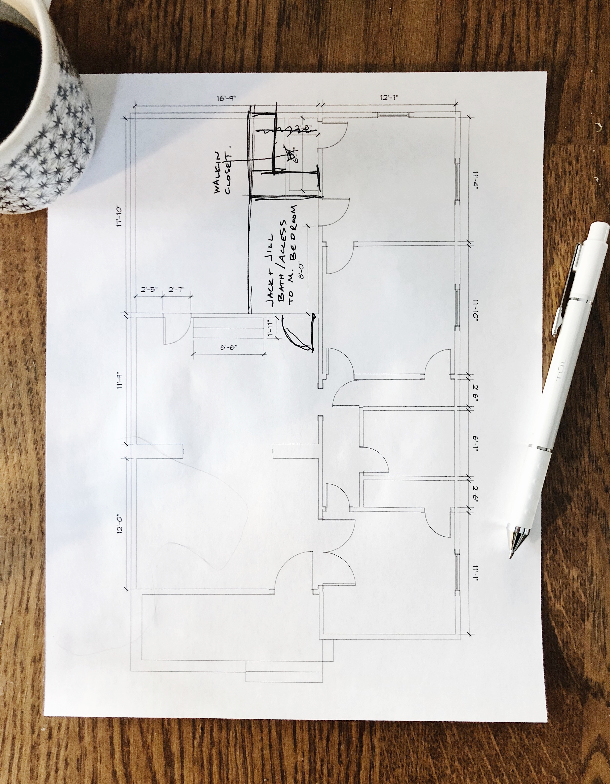
/Glory be! Redesigning the kitchen layout has been a doozy. I first talked about it in this post seven months ago where I laid out our must-haves, some sketches, a video walk-through, and a few thoughts on the matter. I asked readers to share their designs and give me feedback, so that’s what I’m here to do today - after a brief half a year of noodling on the designs.
I urge you to check back on this initial post, because if you don’t, you’ll have LITERALLY no idea what I’m talking about. In an effort to not be repetitive I’m just going to twist your arm and make you read the original post instead of recapping it here. Okay? Okay.
Seriously, did you look at the first post or at least skim through it to look at the photos? Yes? I’m trusting that you did because I linked to it a total of four times.
Okay, let’s get in to it.
I got so much great feedback from all of you about what you’d do in my case or what you’d like to see in your home’s layout should you be house hunting for a similar abode to mine. Thank you all for your thoughts!! Here are some of the ideas from the comments and what landed in my inbox. I’m fascinated by each of these!
Alison’s Plan
My pal Alison of Deuce Cities Henhouse sketched out a plan I had noodled with as well - and that’s why we’re friends, we think alike.
I love that it doesn’t reduce the size of the den/second bedroom! It also utilizes a blank space in the dining room to help avoid a hallway. Since I had this same plan in mind at one point, I combed through the negatives already. Having the bathroom off the dining room doesn’t allow for any natural light or ventilation and this layout wouldn’t leave much room for a shower. So, my idea was to flip it and put the closet by the dining room and the bathroom by the backyard, but I could never find the perfect layout to maximize space. Mostly, the biggest concern is that the closet would be off the dining room, which is kinda sorta weird to be a place nakedly searching for clothes. But is it better than making a bedroom small? I dunno - I rather like the closet off the dining room. All that being said, it’s a definitely option and I’m toying with an idea just like this, so keep reading and stay tuned!
Meredith’s Plan
Meredith had the same idea as Alison and I! She created access to the master from the dining room with a closet/hallway before stepping into the master. She suggests installing a swinging door like we have going to the kitchen so they match. I think if I did this plan I would remove the door to the kitchen, and put the original door on the closet access. She also bumped the bathroom into the kitchen and reconfigured the layout. This is definitely a contender, but the primary con again is if I want to get to the master through the dining room. This plan also closes off the door from the guest room to the master which is great, but now that I added the new door in the master, we lose all that light down the long hallway. I’d also want to play with the bathroom layout to give us a window that would be hidden by the mirror over the vanities in her plan. But, she’s definitely on to something!!
Pamela’s Plan
Pamela’s design is a spiffy idea and creates more of the “open-concept” kitchen and dining idea that’s oh-so-popular nowadays. I truly don’t mind (nay, prefer?) not having an open concept, so this isn’t something I’m really striving for. However, her design is something I could totally get behind. Pamela’s modification brings the living/eating areas more central to the house which feels like the true heart of the home. However, there are a couple of cons (as is with any design). I’m not a huge fan of moving the kitchen away from the backyard. I’d like to have these two spaces more integrated, rather than separated by a hallway. Also, the views on the north side of the house are nothing to admire, so having the master bath window look that way is a bit of a bummer and there’s far less privacy than looking into our own back yard. I wonder if I would have gone for this layout if I hadn’t lived in the house as-is for a few years and got the existing layout so ingrained in my head!
Sandi’s Plan
Sandi mocked up a great plan that adapted my master/closet idea but instead of a peninsula, she rearranged the kitchen to allow for banquette seating. I’m a definite fan! I considered banquette seating for awhile. It’s cozy, fitting with an old house, and all-around a warm and inviting part of a kitchen. I veered away from a banquette idea primarily because I want to maximize work surface areas and a peninsula gives more countertop surface that a table wouldn’t be able to fully substitute. Additionally, there’s something nice and casual about sitting at a peninsula/bar and facing the person prepping food, rather than hunkering down at a bench in a corner. I still gravitate to the banquette every once in awhile, so maybe I’ll come back to this concept again!
Emmett’s Plan
Emmett’s (husband to Sarah of Room for Tuesday) plan is definitely the most unique. Adding french doors to the kitchen sounds great, and not having to make the guest room smaller is a win. I like the idea of walking through the bathroom to get to the closet (or even vice versa) because it reduces the number of doors in the bedroom. (There’s a bunch of doors in this house!) However, the kitchen layout is too unconventional for me, and it doesn’t provide any seating. I love that big bank of pantry storage and the pass-through bathroom though, so note taken!
Sarah’s Plan
Sarah of Room for Tuesday devised a plan that keeps the gigantic footprint of the kitchen, which is quite a dreamy amount of space. She whipped this up when I pressured her, so I rushed her and she didn’t finish including closets, but I’m sure there’s lots of space in the kitchen to borrow those for. Her idea of putting access on the other side of the dining room hutch keeps coming up again and again so it has me thinking. A few years ago, I toured a house that reconfigured the kitchen in a similar way and they kept the original door in place, but created a super shallow bar behind it. In the kitchen, you’d never know, but from the dining room, you’d have sleek storage - it was pretty genius.
Cathy’s Plan
Cathy’s plan made my jaw drop. She’s the one behind The Grit and Polish and she’s clearly a wizard at fixing up old houses. Her layout provides so many of our wants like sight-lines to the backyard from the sink, retention of some of the guest room space, a wall of pantry storage, a functional kitchen layout with seating, great flow from the dining room to the backyard, and access to the master without going through a bedroom. The only cons were that the master access is kinda through the kitchen, the bathroom is on the petite side, and the kitchen layout gets tight with seating at the island and a snug corner by the sink. That island would only be able to be 24” deep at max, because of the need for space to walk on either side. Another issue I’ve run into is the City won’t let me add more windows next to the existing two in the kitchen, so there’d be off-balanced windows on that wall with a big blank space. (I’ll get more into why the City is like this later) But seriously - jaw drop.
Sarah’s Second Plan
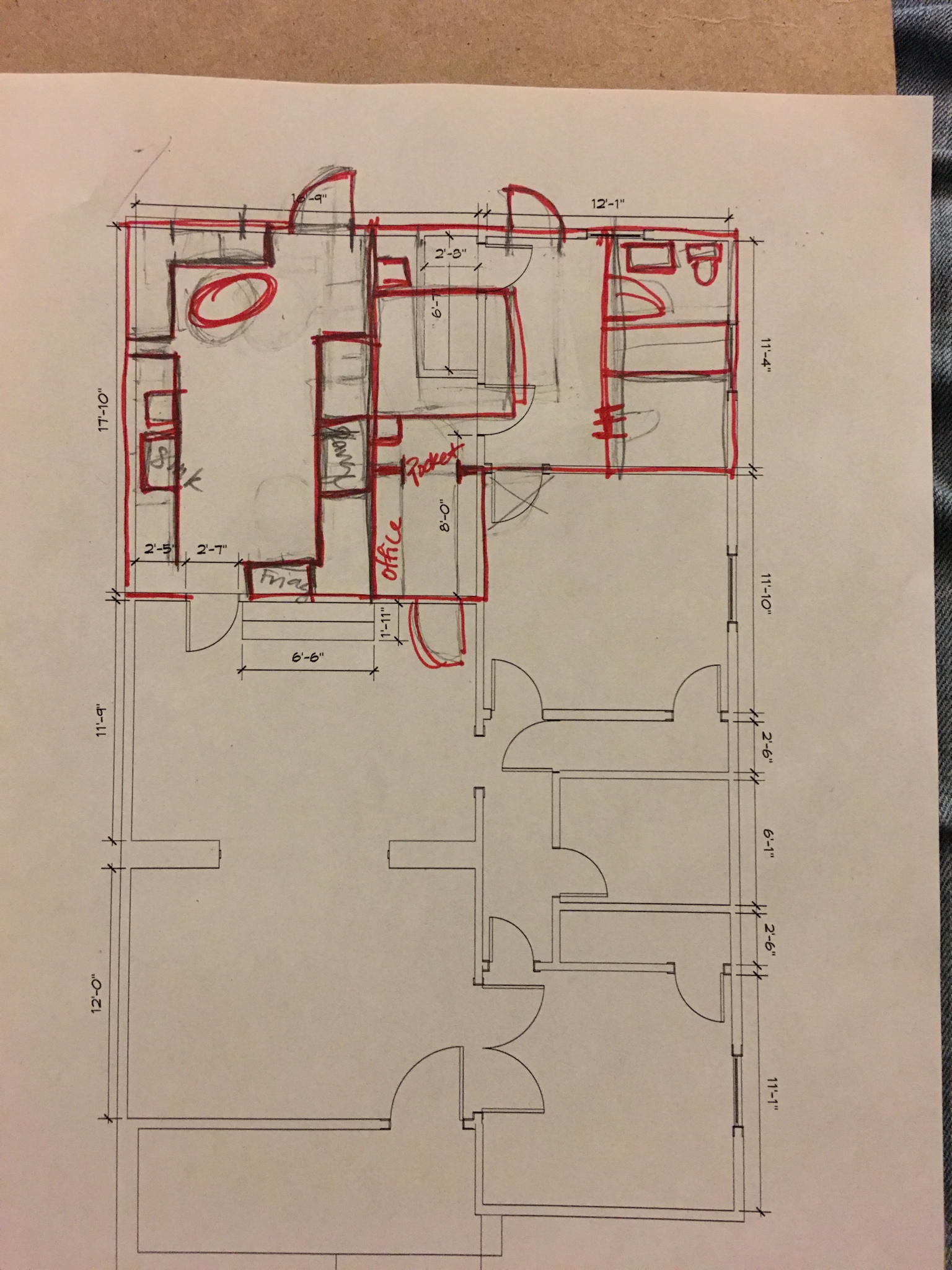
I was chatting with Sarah about her plan and Cathy’s plan one day when she was humoring me and she devised a fun bathroom option. Using Cathy’s overall floor plan, Sarah created a bathroom/closet combo with just one door from the master to this combo space. She originally drew a tub as a focal point, but I asked how I could adapt it for a shower, and she added the black doodles atop her original design for me. It’s definitely appealing and a cool idea. Ross and I don’t have much in the way of clothes, so narrow closets could certainly work for us, but I do worry about resale. The combo room is definitely appealing!
Cathy’s Second Plan
After publishing this post, Cathy got back to thinking and devised another version. Yet again, she’s thinking so creatively and so smart! In this plan, she shifted the master bedroom to the front of the house and is converting our existing bathroom into the ensuite master bathroom. She added a second door to the long closet, and walled off the glass french doors to the living room for privacy. The entrance to the master would be just before the bathroom if you’re walking in from the dining room. Then, the back bedroom is accessed either through the second bedroom or through the kitchen (through the door that I already walled off - but that’s okay). The third bedroom would keep its closet, and the guest bathroom would be off the kitchen. The benefit of this plan is that we keep the size of the second bedroom, maintain the long sightline from the front to the back of the house, get seating in the kitchen, and get a pretty well-sized kitchen! The con is we’d lose the mural in the office, put the door that I just removed back in the master, have the bathroom off the cooking area, lose the french doors off the living room, and lose access to the attic (which is currently in the office closet). But all of those trade offs are pretty slim, so she has me really thinking about this!
Ashley M’s Plan
Reader Ashley (not me) has another idea that’s a combo of multiple ideas, but with a flip. She added a hallway to the living room, but turned it into a small office which is such a nice future-office when our home office serves better as a bedroom. To make it less zig-zaggy, she moved the bathroom/closet area to the other wall so that the office hall opens up into the bedroom. This solves a lot of the problems for sure, so I’m pondering it!
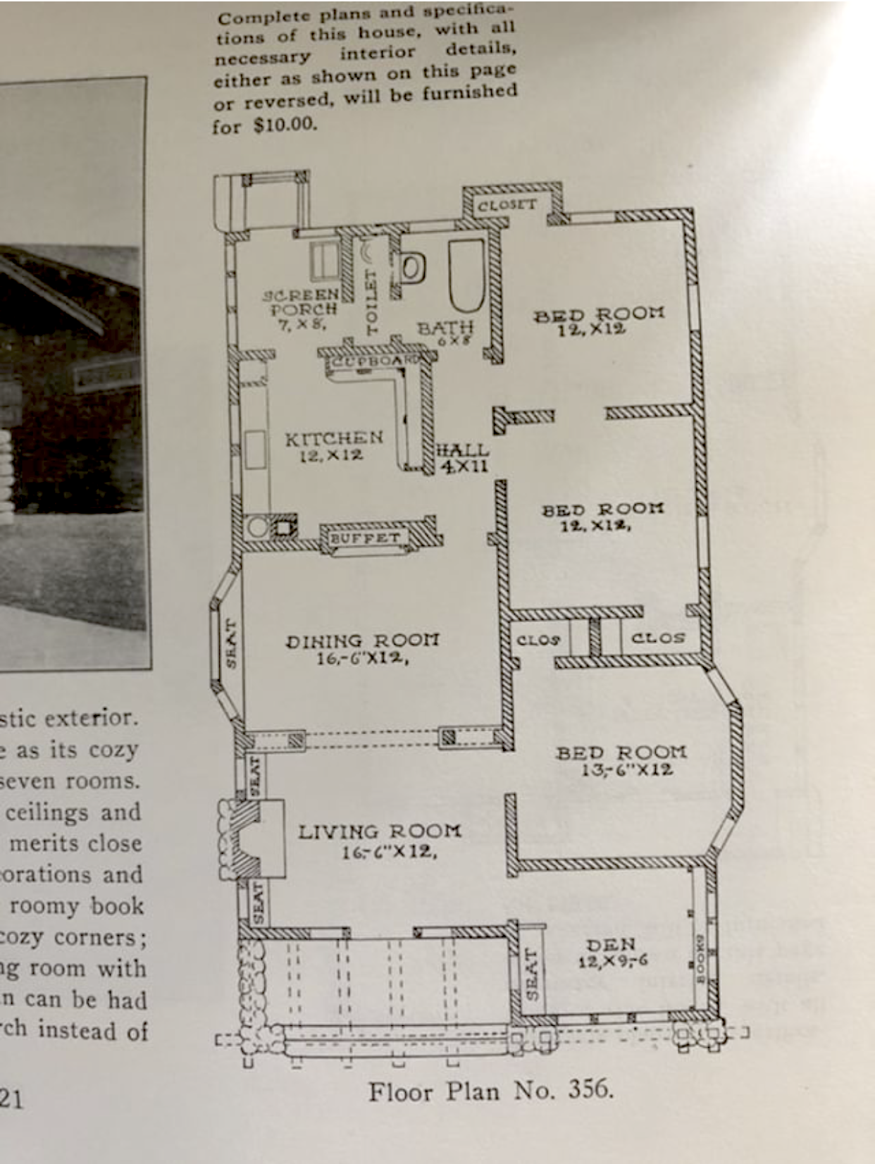
Vintage Bungalow Plan
Here’s a real-life actual vintage floor plan that could be purchased if you were building your home from scratch 100+ years ago. The footprint is nearly identical to my house but has some minor modifications that have me really analyzing it.
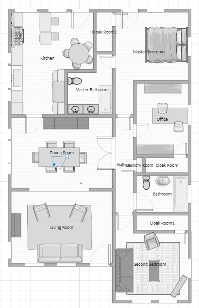
Corlies’ Plan
Corlies went through the trouble of building out my whole house (in the same software I use!) - what a peach! A part of her plan that I like is that she relocated the french doors into our current home office to the dining room where they open up into the hallway. I always thought that when this room became a kids room, we’d hang curtains on the doors or remove them entirely (I’m not convinced they are original). Moving them to the hall would be lovely! Her plan also allows us to keep the windows and doors of the kitchen in the same spot - which is something that the Historic board might make us do so this is definitely an option to really consider if we aren’t able to change the doors and windows like we had previously hoped.
A few other thoughts and suggestions from folks:
Widening the opening from the dining room to the hallway to make it feel more open and let more light flow through.
Install french doors to the backyard from the master instead of a single door. This one I can’t argue because I already installed a single door and I LOOOVE it paired with my old window. We get lots of natural light and don’t feel like I need a french door to get that sunshine!
Flip the peninsula in the original design so people don’t need to walk through the cooking area to access the seating area. This is a very fair point that I overlooked, but it deserves more attention than I gave it.
Lots of people said making the guest room smaller is a horrible idea and lots of people said it was no big deal. I feel like the split is divided between people with bigger houses that are used to bigger rooms, and smaller house dwellers that are accustomed to smaller rooms. To each their own!
Add big french pocket doors for the guest room if creating the hallway - it will bring in more light! While beautiful, the con to this is that it feels less like a bedroom, and we already have double french doors to our third bedroom (which we use as an office) so I don’t want to make the house feel like it has only one bedroom.
Make backyard access key! Someone even suggested moveable cabinets to turn base cabinets into an outdoor bar. So futuristic!
I feel like this post is getting too lengthy to start getting into where I’m at currently with floor plan thoughts, so I’ll come back with another post where I ask you to weigh in on it all. If you have any thoughts about these designs, lemme know in the comments! If you want to make a sketch, download a printable PDF of our current layout here.
Big thanks to everyone that sent me a drawing or messaged me with ideas for my home! This indecisive non-professional loves getting your wisdom.

