Classic Tile in the Bathroom
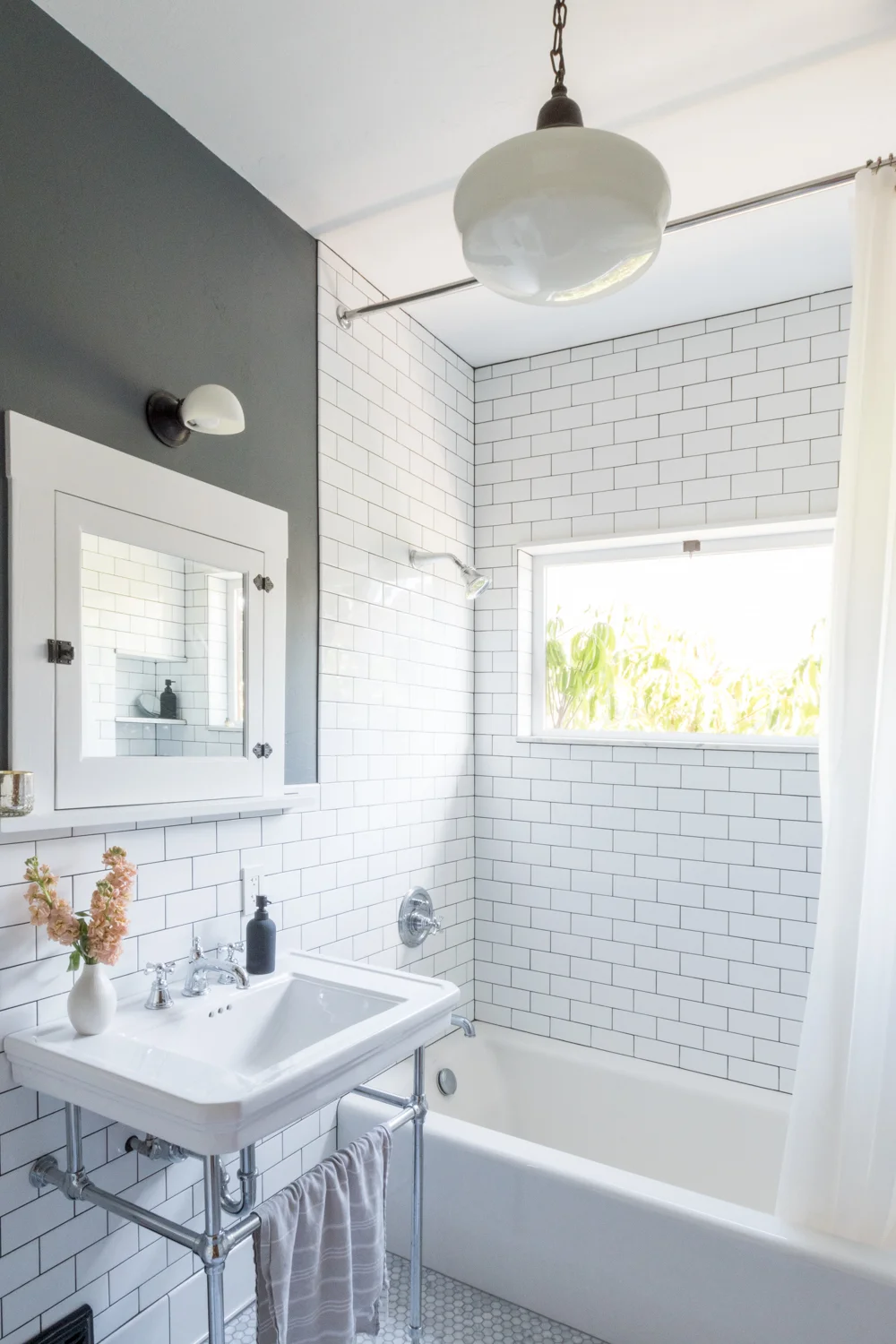
/If you saw my post about the bathroom inspiration, you'll remember that it was chock full of classic vintage vibes complete with subway tile, marble, and contrast grout. Thus, that's exactly what we went with when we gutted and remodeled the bathroom two years ago.
I already knew I wanted subway tile, and even considered crackled, textured, and irregular styles before ultimately deciding on these crisp white ones from the Tile Shop (which are currently on sale). But, it's not as simple as just picking the tile. Below I'm sharing our thought process for tile design.
Pattern
We did a simple running bond pattern throughout. There are actually several ways to lay a subway tile in a subway kinda way. Check out the examples here. Since we were going with a dark grout, I chose a pattern that didn't have as much movement as say the 1/3 offset.
Layout
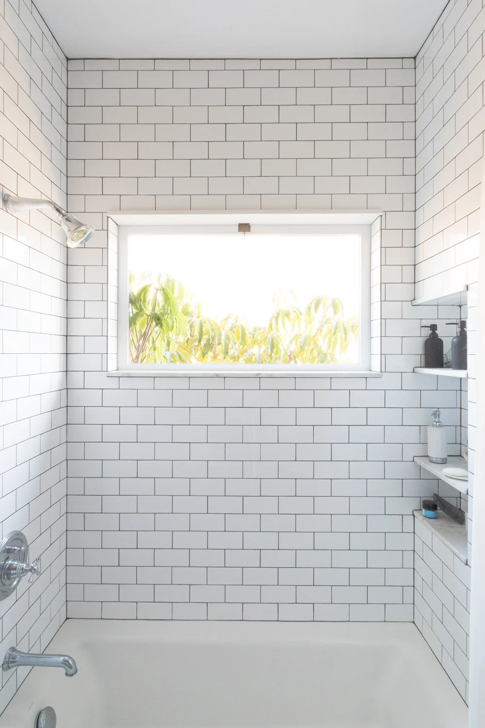
I can't stand when tile doesn't go to the ceiling in a shower. I know, it isn't necessary. It can be a waste of money to tile 3 feet above your head where no water will splash, but I really am a sucker for fully tiled showers.
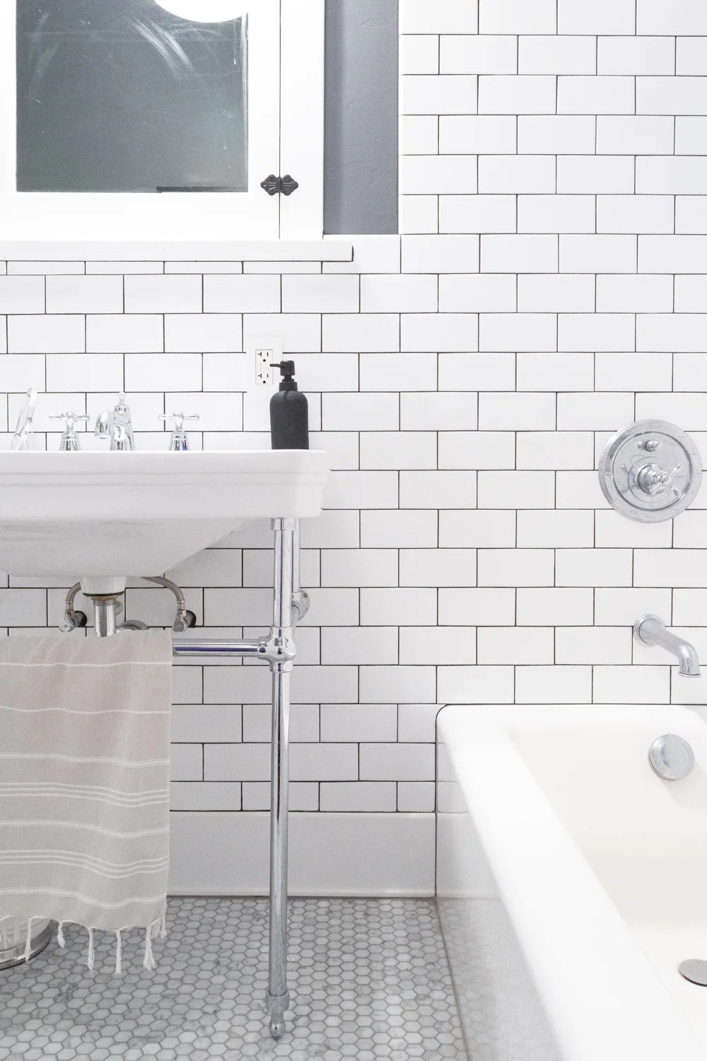
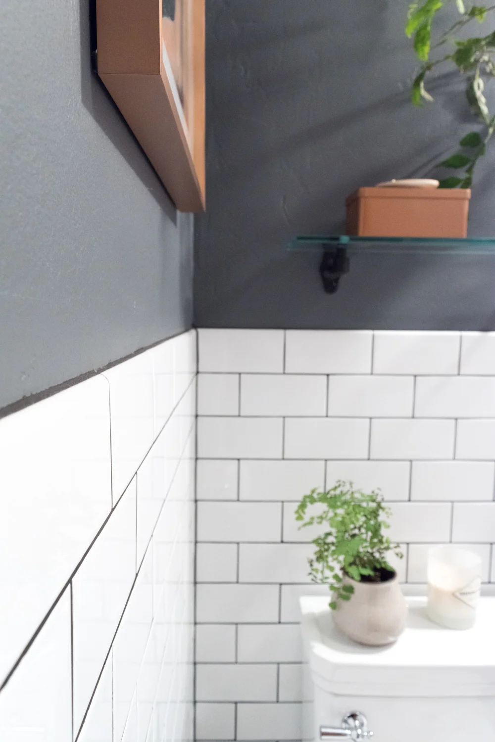
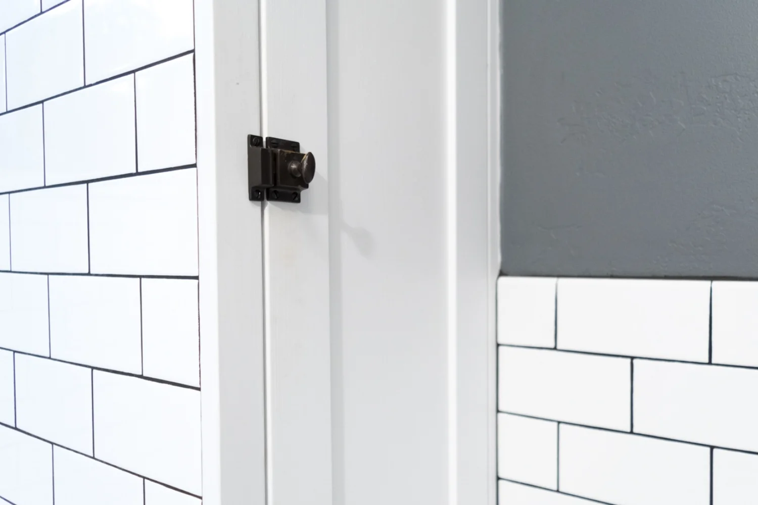
Since I was already going for lots-o-tile in the shower, we decided to surround the rest of the bathroom walls mid-way to a chair rail height. This look helps me to feel like I'm living in The Knick. The medicine cabinet determined how high we would go, since I didn't want it floating above the tile, nor drowning in it. For reference, the tile stops 50" up the wall.
Finishing
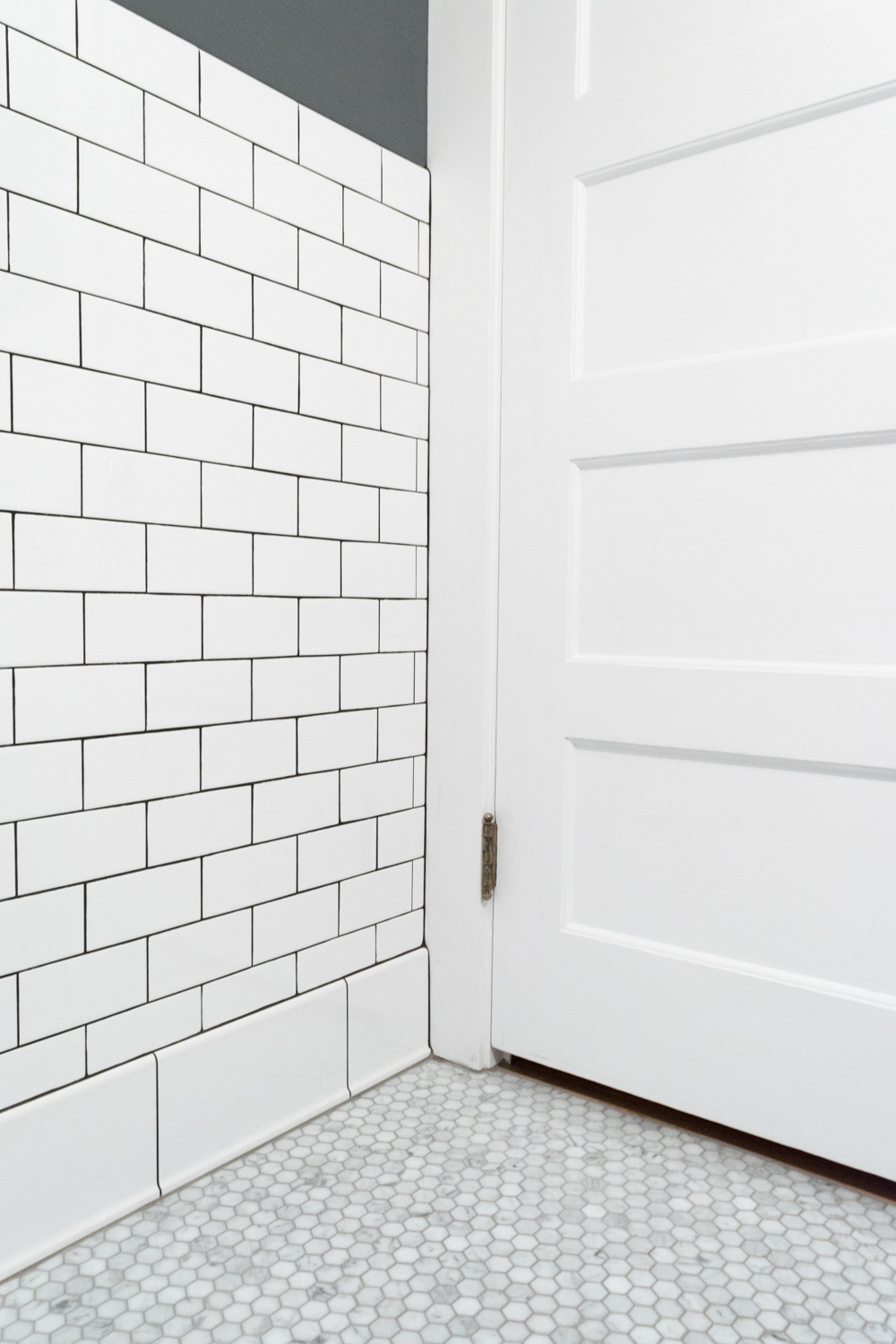
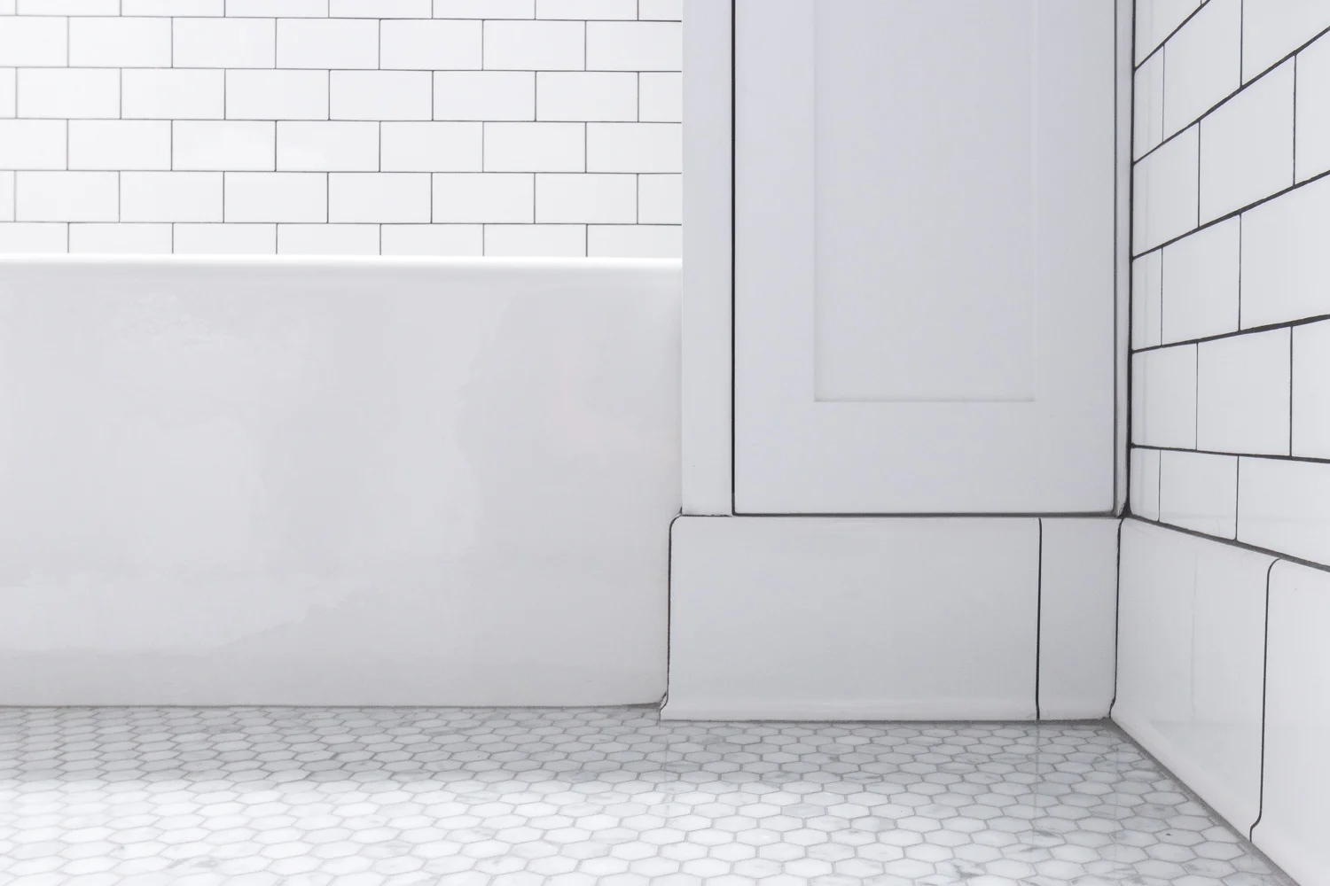
We nearly did a decorative cap around the top of the chair rail, but ultimately nixed it when we didn't like how it terminated at the edges. So, we did a simple bullnose along the top edge of the same-sized tile as the field tiles. I like that this modernizes some of the other vintagey-vibes in the room. For the base, I went with a baseboard skirting that finishes off the space with just a lil' bit of detail.
Grout
Contrast was the name of the game with the wall tile, so we did a deep charcoal to make the pattern pop. Also, dark grout doesn't run the risk of looking dingy. Win!
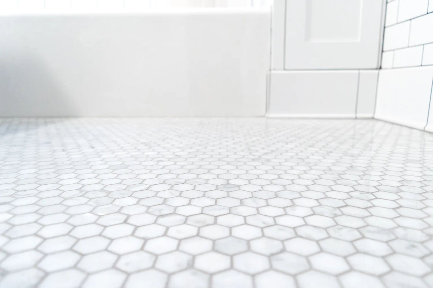
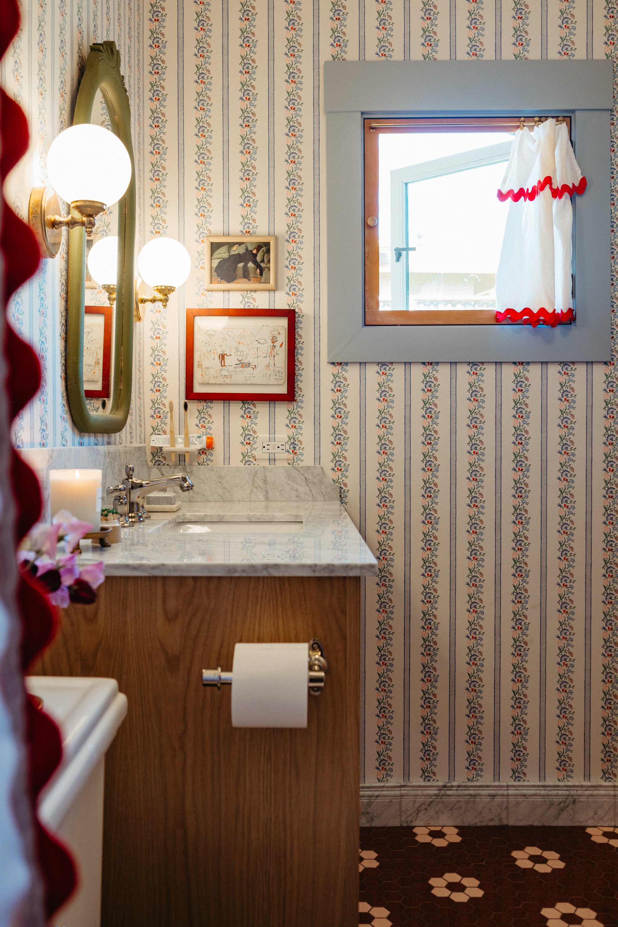
The flooring had lots of texture in its marble veining and hexagon shape, so we went with a gray that would neutralize the pattern. We went with Delorean Gray.
Accents
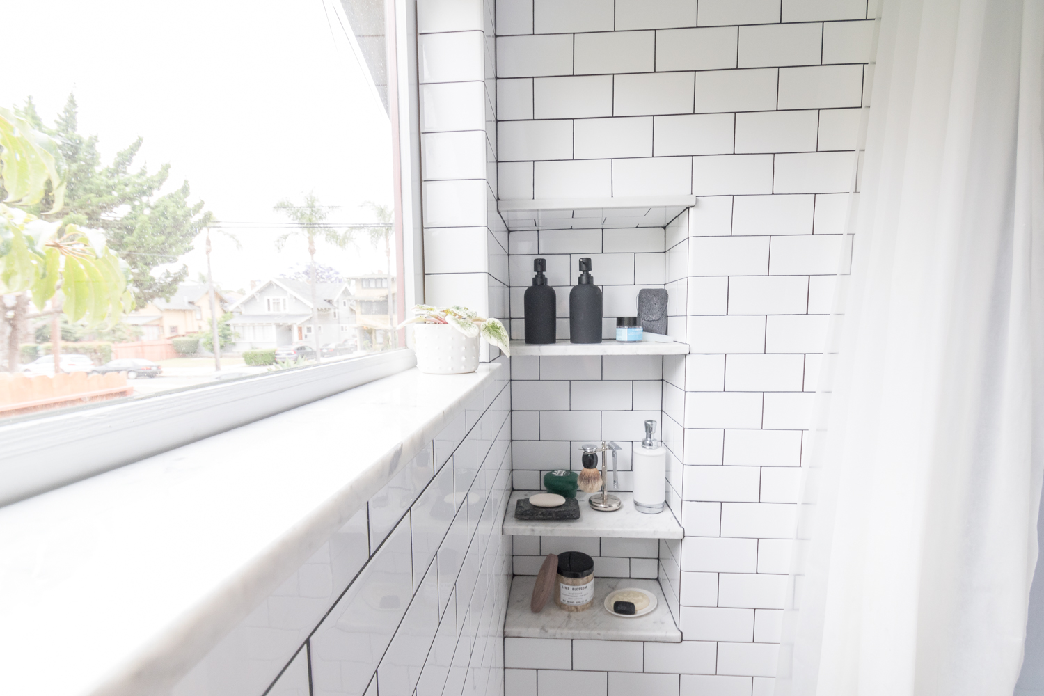
For the window ledge and the niche shelves, we installed a few pieces of marble slabs. They are gorgeous and the perfect material for a solid surface to rest our toiletries atop of. Plus, they tie in to the marble floor.
There are so many details that go into laying tile and ensuring that you're forever happy with the pattern, but I opted to keep this post pretty simple. If you want the specifics, let me know!
For more on the bathroom renovation progress click here! And to get all of the sources and see the full reveal, click here.

