One Room Challenge Week 7 - The Office and Mural Reveal!
/Can you believe the One Room Challenge is over!? The day we've all been waiting for is here - the reveal! I've spent the last seven weeks completely transforming our home office and I'm thrilled to finally share it.
If you're anything like me and can't stand watching TV shows out of order, you can catch up on the progress at each of the below links.
Week 1 - the before, the inspiration, and the plan
Week 2 - preparing for a bold wall mural
Week 3 - tricks for creating a perfect wall mural
Week 4 - painting the mural
Week 5 - walls, windows, and shades
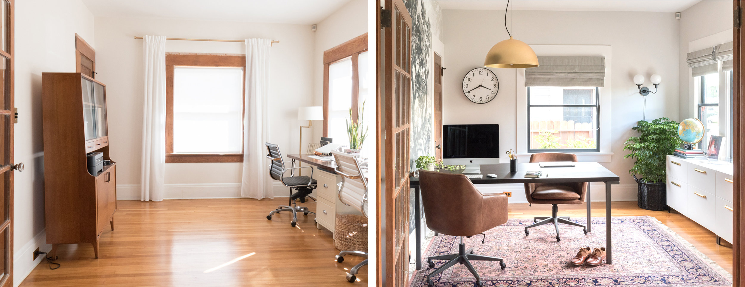
If you're already caught up but want a refresher, take a look at the before photos.
And since side-by-sides are the best.
The room got an entirely new layout, lighting, storage, and window treatments, but most dramatically, an accent wall mural.
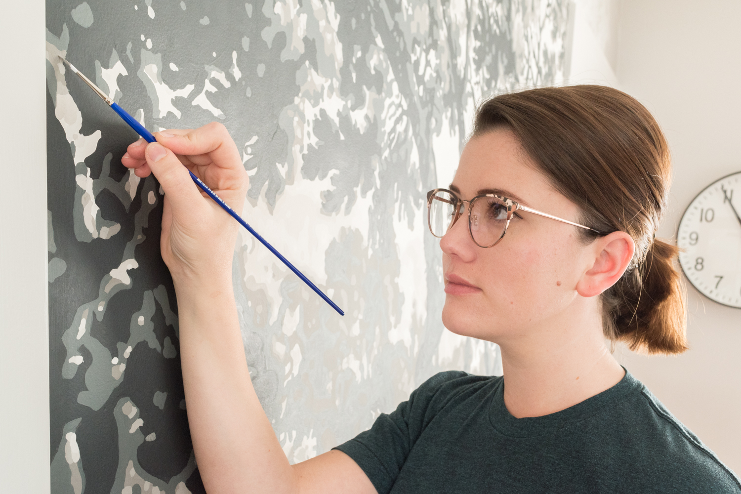
I think I put in about 100 hours painting this thing and I'm so tickled with how it turned out!
Come back next week when I release a video with a full time-lapse from start to finish!
As a reminder, I used an image I found on the Met's open source image archive, converted it into an image to project on the wall, then coated eight different colors (two layers each!) using beautiful paint from Farrow & Ball to get to where we are today.
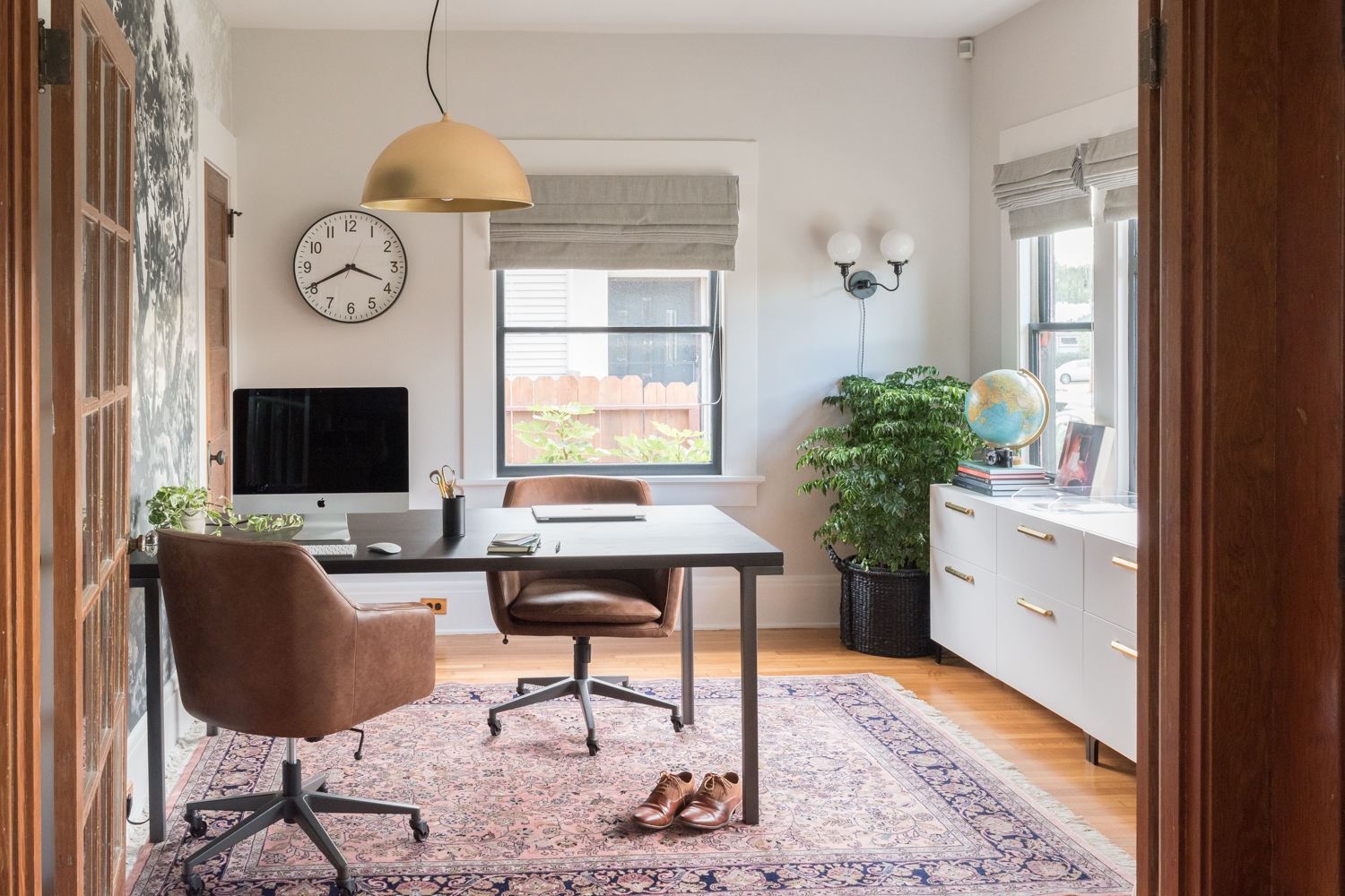
We rearranged the layout to make better use of the room. The desk, which is actually a dining table, gives us more room to spread out and it's just so darn pretty with its black top and metal legs.
To make the table function more like a desk, we devised a cable management solution that lets us plug in our devices without cords dangling everywhere. We screwed the grid-it to the underside of the desk to keep our power supplies for our computers contained and also as flush as possible to the bottom of the desk. We also attached a cable clip to the corner and adhesive on the leg to run the extension cord along the leg to a nearby outlet. So many typical cord storage options are chunky and thus would be visible from nearly any angle. This configuration is invisible unless you're looking for it!
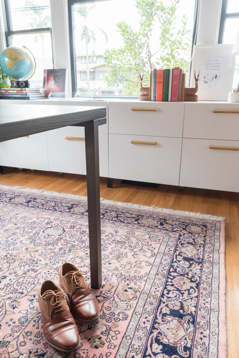
Speaking of storage, we put two IKEA cabinets side-by-side and customized the interior for all of our supplies. Be sure to check out last week's post detailing how we customized a ready-made piece.
Since Ross does most of his work on the road, his backpack is his portable office. The backpack used to get plopped on the floor in the corner whenever he was home. Now, it has its own spot in a basket.
Every office needs a graphic clock. One of the volunteers at the nonprofit I work at spotted this one for me and knew it was the perfect fit. Thanks, Nancy!
We moved the ceiling junction box a few feet over to provide task lighting for the desk. This brass beauty casts a lovely warm glow over the desk in the evenings.
This wall sconce that I customized from one of my favorite Etsy shops lights the corner when the sun isn't pouring in. That globe also lights up, too!
You'll notice that the trim got a couple of coats of paint. I shared all about prepping walls for paint here and I talked about the woodwork painting debate here. Spoiler: I'm still a wood purist, which, while it seems oxymoronic, is why this severely damaged trim needed a slathering of paint.
We're lucky to have sunlight flood into this south and west-facing room, but sometimes it's a bit much. We added roman and solar shades to give us a variety of sunlight adjustments.
I have the hardest time picking rugs. Why? I have no idea! Someone help me next time! For this room, I wanted something traditional but not too high-contrast. I like the muted palette of this one and it's seriously the softest rug in the whole house. The. Softest.
Because the mural is such a statement, I didn't want to go wild with graphic art, but I couldn't say no to the two pieces that live on the storage unit. Artist Mary Sinner is one of my favorites and she kindly sent me this original that I can't get over.
On our latest vacation, we picked up this print in Austin by Jon-Michael Frank. We knew it would be the perfect print for our office - even before the One Room Challenge was a twinkle in my eye. The print cracks me up every. single. time. I look at it.
Get The Look:
If you're tuning in via the One Room Challenge and want to stay up to date on all of my home's transformations, subscribe to get future posts in your email! Also, follow along on Instagram for daily updates.
Big thanks to Farrow & Ball for supplying the paint to make the mural possible! For a full breakdown on each color and the painting process, click here!
Fall One Room Challenge progress:
Week 1 - the before, the inspiration, and the plan
Week 2 - preparing for a bold wall mural
Week 3 - tricks for creating a perfect wall mural
Week 4 - painting the mural
Week 5 - walls, windows, and shades
Week 6 - IKEA storage hack
Week 7 - the reveal!
Look back at the Spring One Room Challenge:
Week 1 - the before, the inspiration, and the plan
Week 2 - paint, paint, paint
Week 3 - how to install picture rail molding
Week 4 - sourcing the artwork
Week 5 - refreshing a chair
Week 6 - the reveal!
I'm not the only one that slaved away to transform a space over the past seven weeks. Check out the featured bloggers and guest participants!


