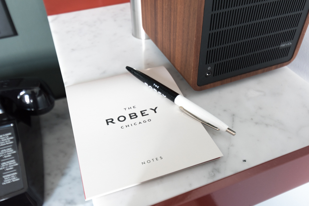
Design Inspiration At The Robey Chicago

Airbnb is all the rage right now, but I'm still a fan of staying in a nice hotel. It's so lovely to return after a long day of exploring to a tidy room with nothing but your own things. You'd think that as a homebody, I would want to curl up in someone's personal reading chair and peruse their collection of tchotchkes, but I'm still a sucker for the hotel life. I think it's those super crisp hotel sheets.

The Robey Chicago

There's so much to be inspired by in a cool city, and why not also your hotel room? I've outlined the design elements that I adored while staying at The Robey Chicago.
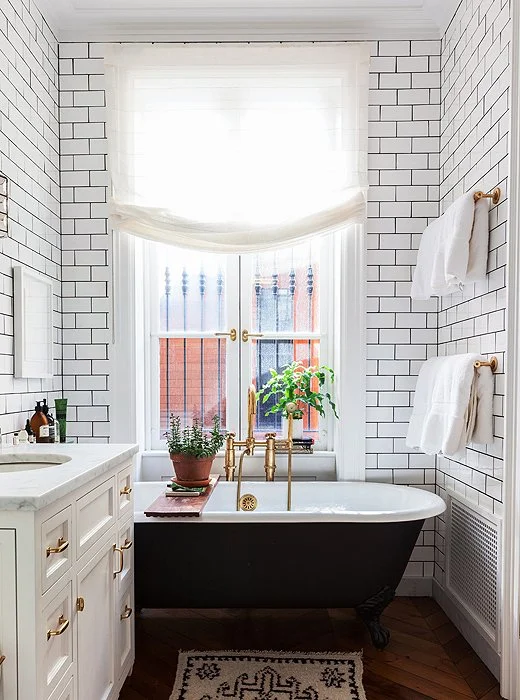
Contrast

The Robey Chicago

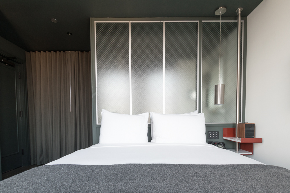
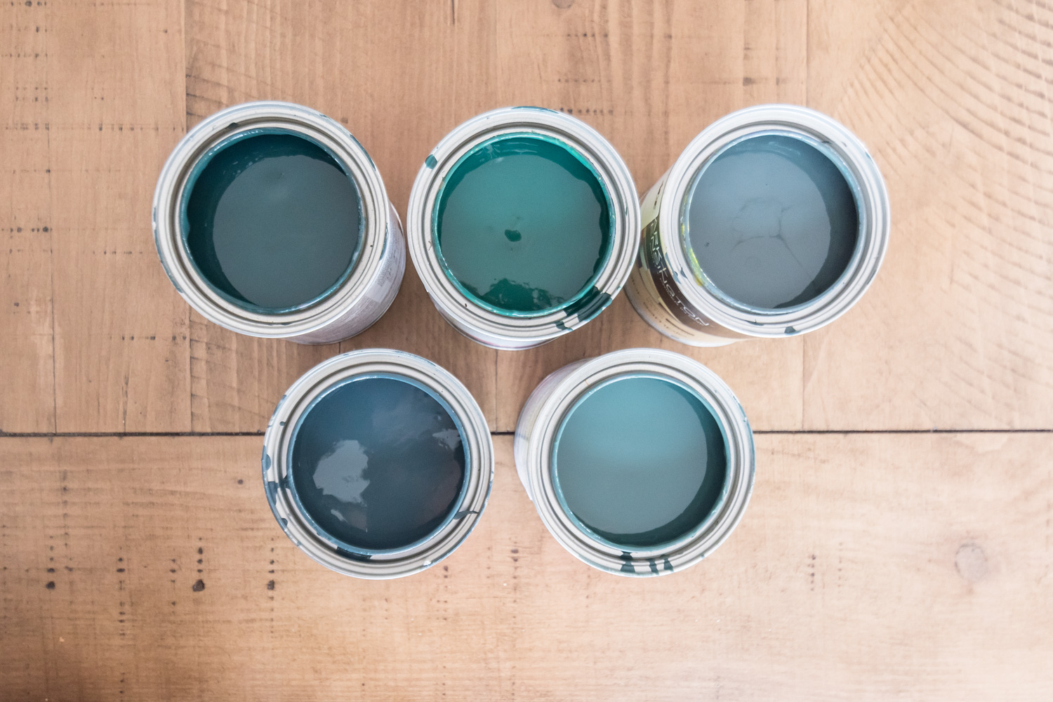
The space is a perfect combo of bright whites and deep greens - my favorite! It's almost like the room was designed just for me and my love of moody colors.

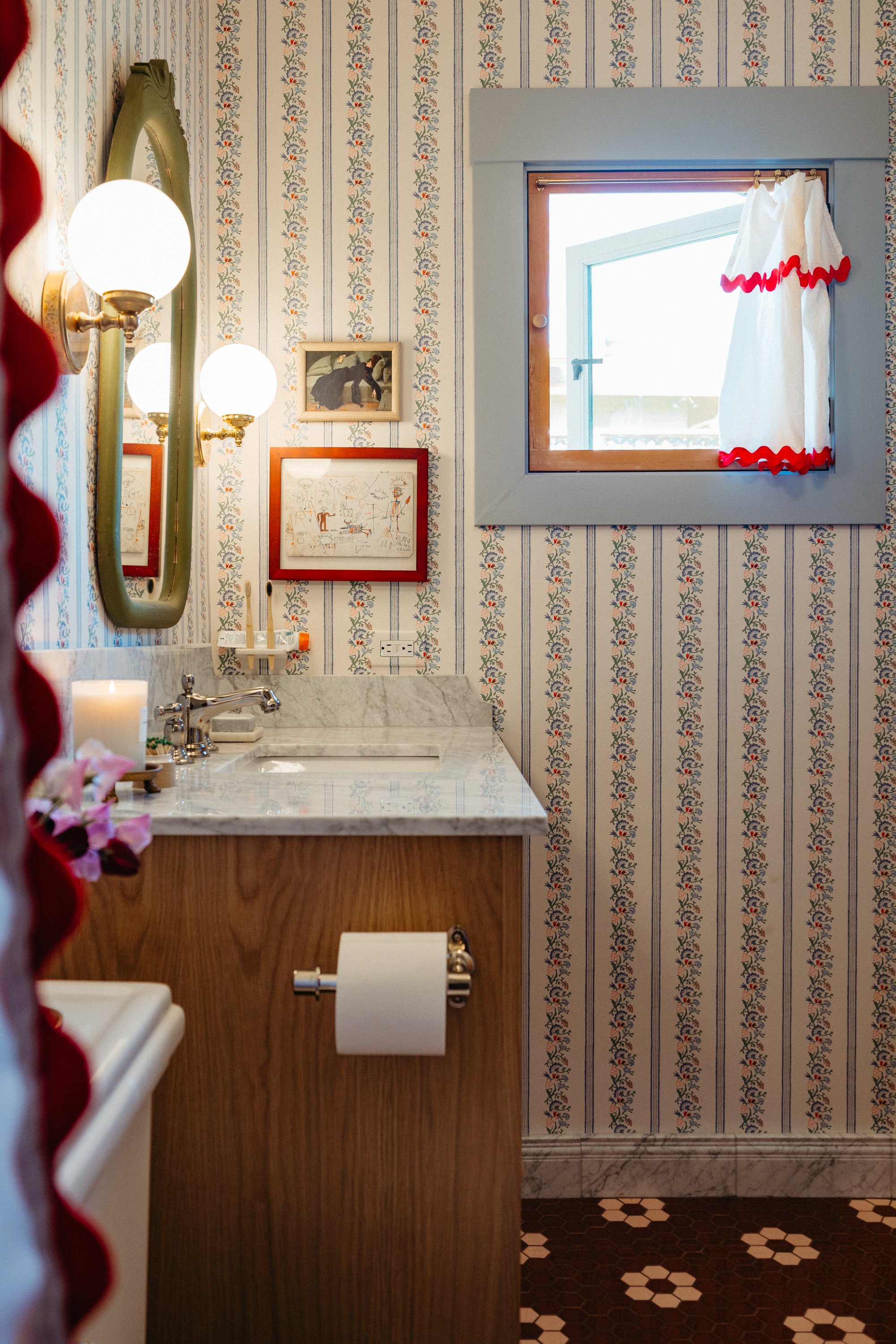
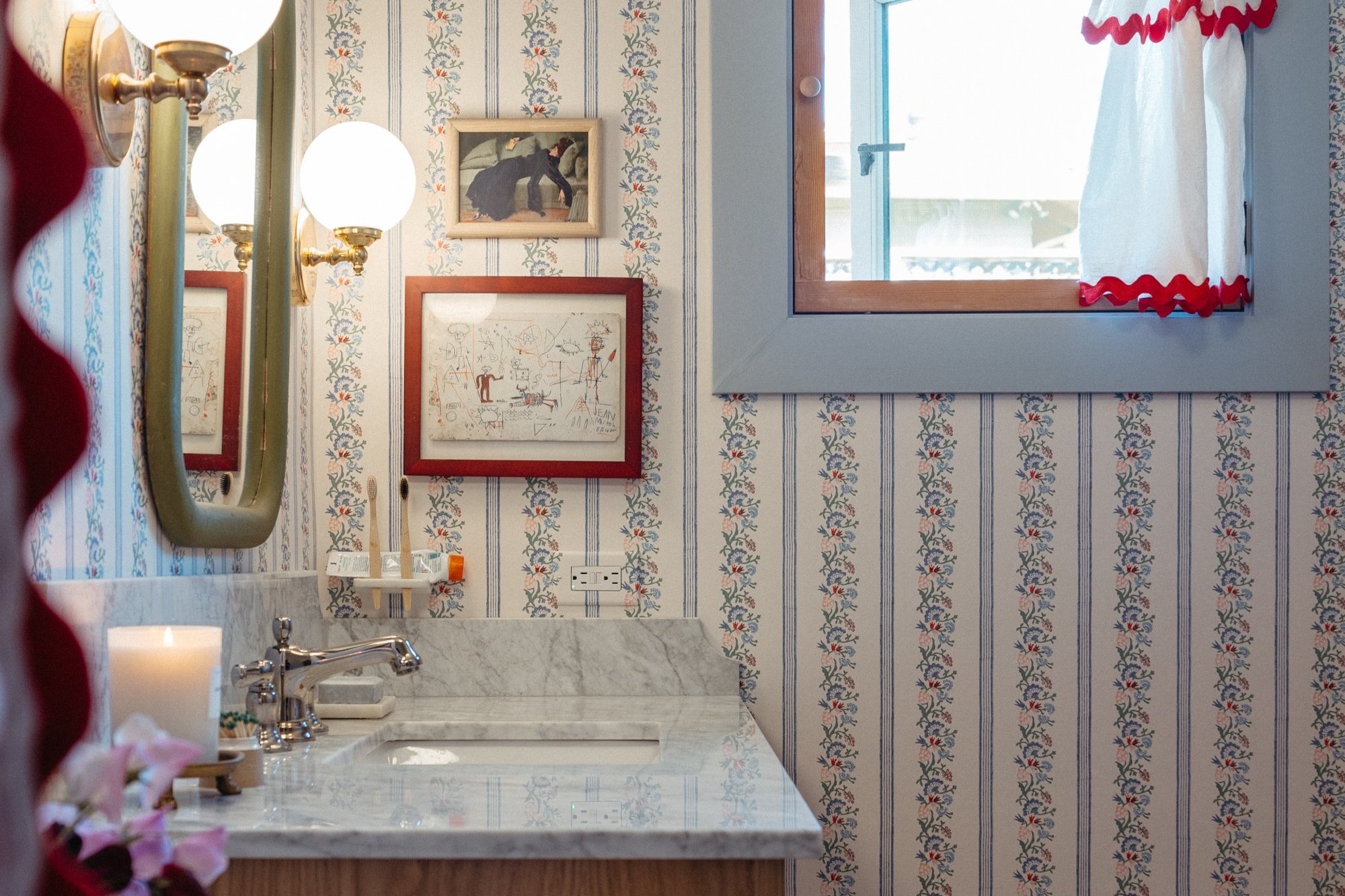
Complementary colors

The Robey Chicago

The pops of red against the green walls are so striking. Admittedly, I don't do a ton of complementary colors in my house. The closest I get is with blues and orangey-wood-tones.
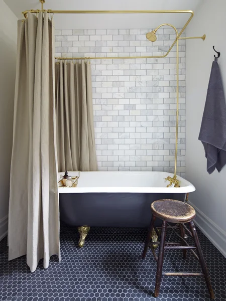
Dark ceilings

The Robey Chicago

I'm totally on board with this trend. If my bathroom walls weren't already so dark, I'd definitely consider painting a deep hue on the ceiling.
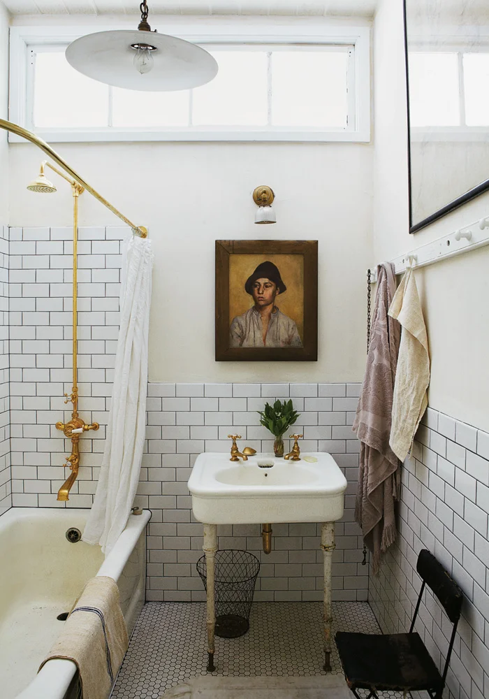
Curtains for doors

The Robey Chicago

Just because you want to cover up some storage, doesn't mean you need a door. When done well, curtains can make a statement that doors can't. I've had the door off of our closet for two years now (haven't scraped the layers of paint off yet) but maybe a curtain is a good solution for now. Emily Henderson recently talked about how she chose curtains for her master closet.

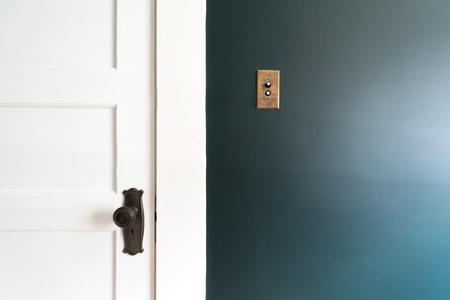
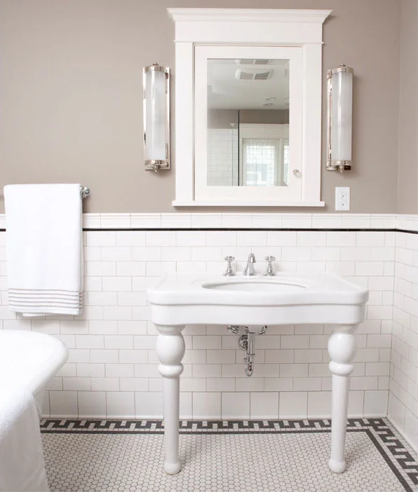
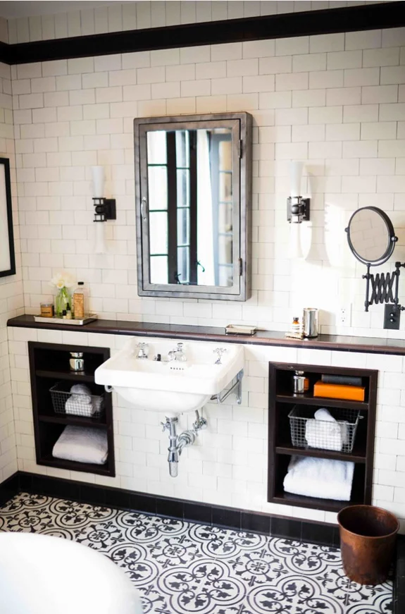
Modern meets heritage

The Robey Chicago
The Robey Chicago

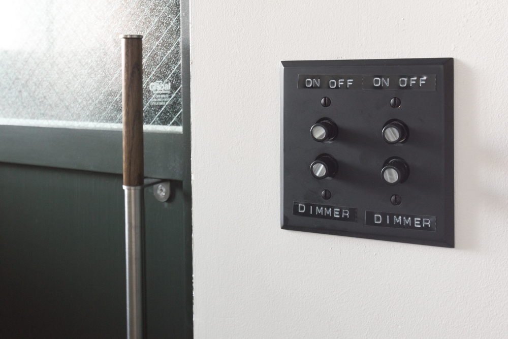
The space feels so trendy and hip with its modern lines and simplicity, yet also so old-school with a nod to vintage elements. Talk about old meets new - that sink and toilet look decades apart. Those retro push button switches reminded me of home.

Delicious scents

The Robey Chicago

The entire hotel smelled so good thanks to the products from Le Labo. I slathered that body wash and shampoo on my person every day so I could smell it constantly. When I went into the perfumery conveniently located next door to the hotel I was in olfactory heaven. Whether you choose to give your home a distinct scent or experiment with varieties, I certainly encourage thinking about the element of smell at home.

See-through walls

The Robey Chicago
The Robey Chicago

These wall/windows let so much natural light into the bathroom, make the bedroom feel so much more vast, and add oodles of flair. The glass had enough texture that bathroom users had some privacy, but probably not enough opacity that I would install them in a wall between a guest bathroom and the family living room. However, I think interior windows could be a great way to share natural light while defining separate spaces. Bring back the transom window!

Which of those design elements do you already have at home? Which are you interested in incorporating?

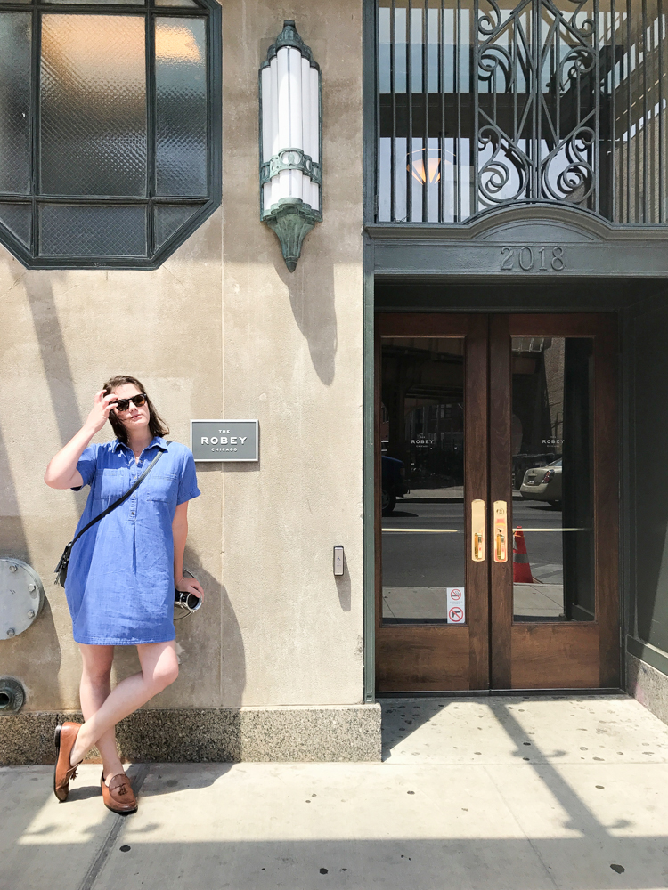
The Robey Chicago is a gem not only because of its style, but also its location. It's outside of downtown in the lovely neighborhood of Wicker Park. Surrounded by delicious eateries and gorgeous houses, it's the tallest building for miles. The views!

The Robey Chicago

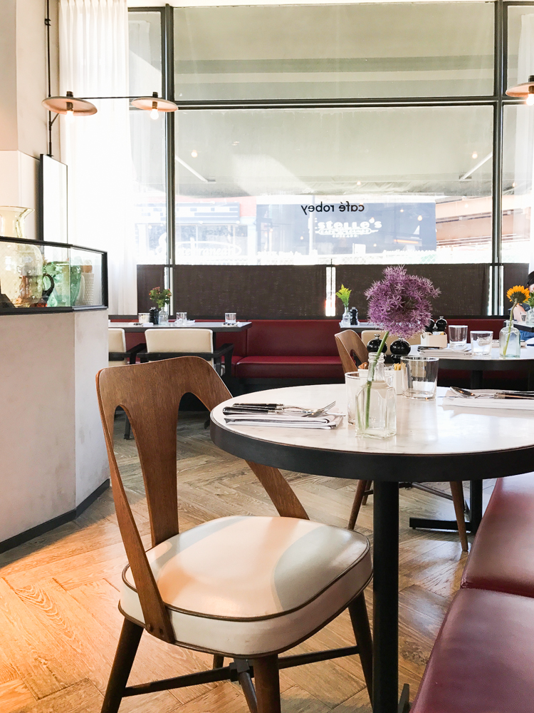
The lobby, lounge, rooftop bar, cafe, and even their elevators are all to die for.

The Robey Chicago
The Robey Chicago

If you saw any of my Instagram Stories, it was no secret that I fell in love with Chicago. The city was such a treat to visit during the most perfect time of year. I definitely attribute my admiration to spending most of our time exploring the neighborhoods outside of downtown where we could see how folks live, enjoy unique restaurants, and admire the amazing architecture. If you have plans to visit, I highly recommend spending lots of your time in the Wicker Park, Bucktown, or Logan Square areas - and The Robey is certainly the first spot you should look at booking.

The Robey Chicago
The Robey Chicago

While The Robey Chicago provided me a discounted stay, all opinions are my own.
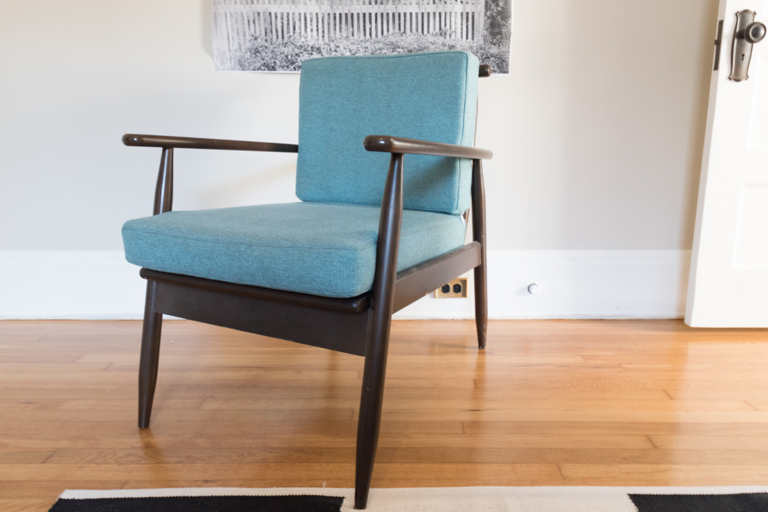
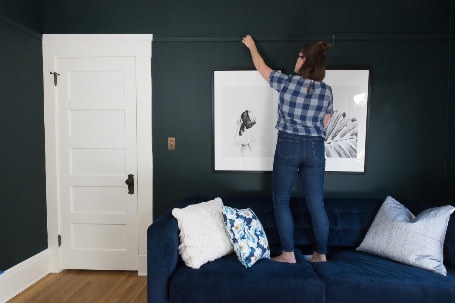
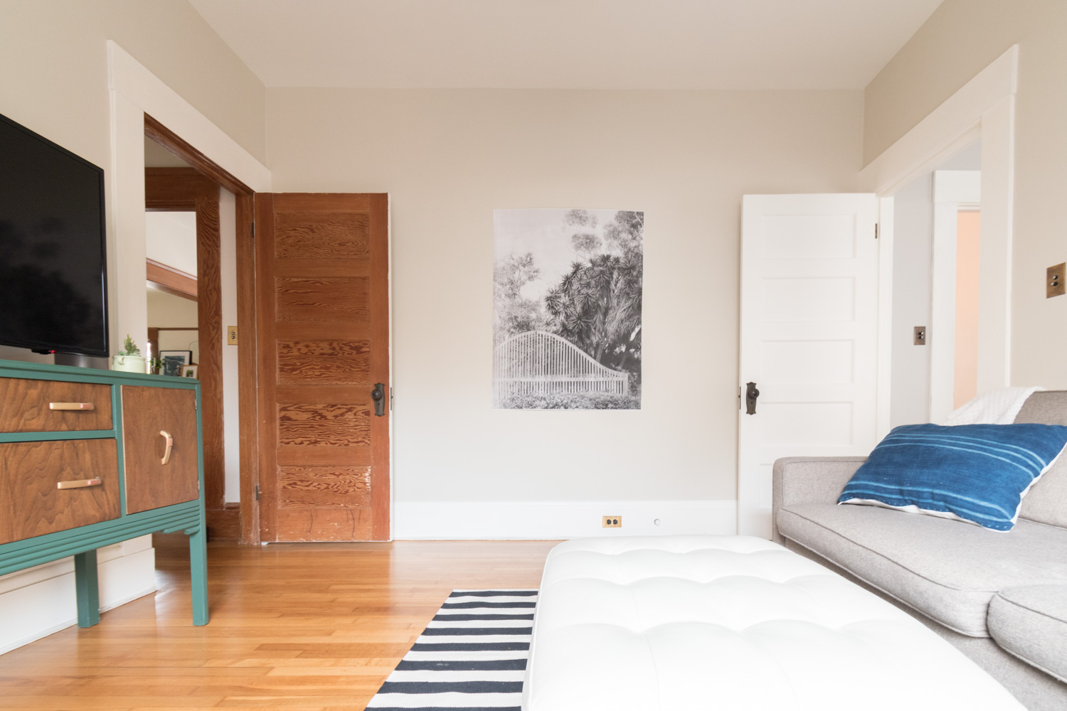
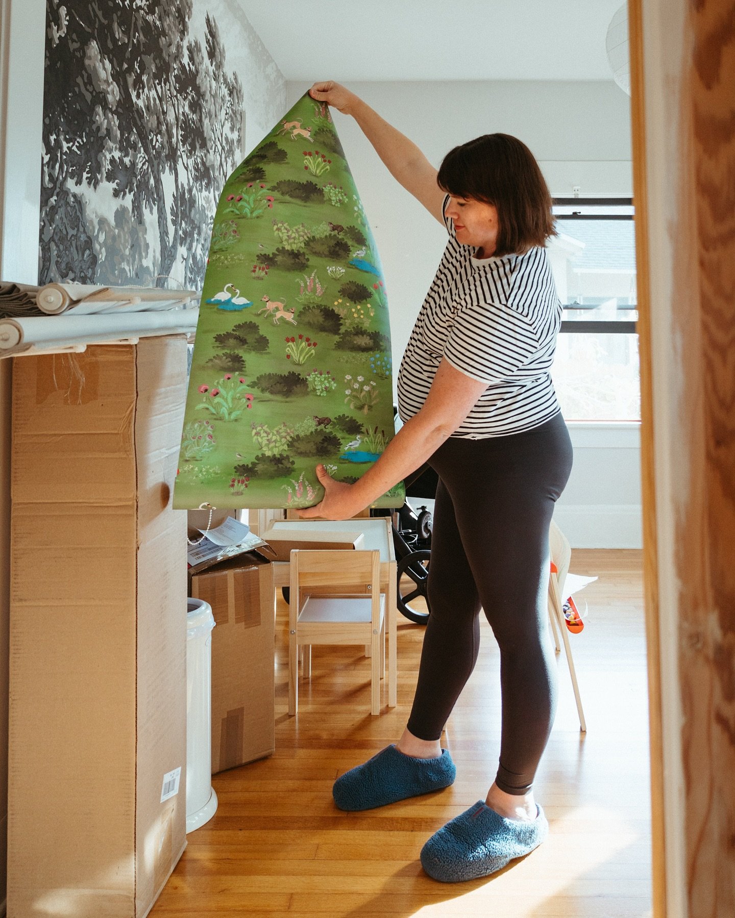
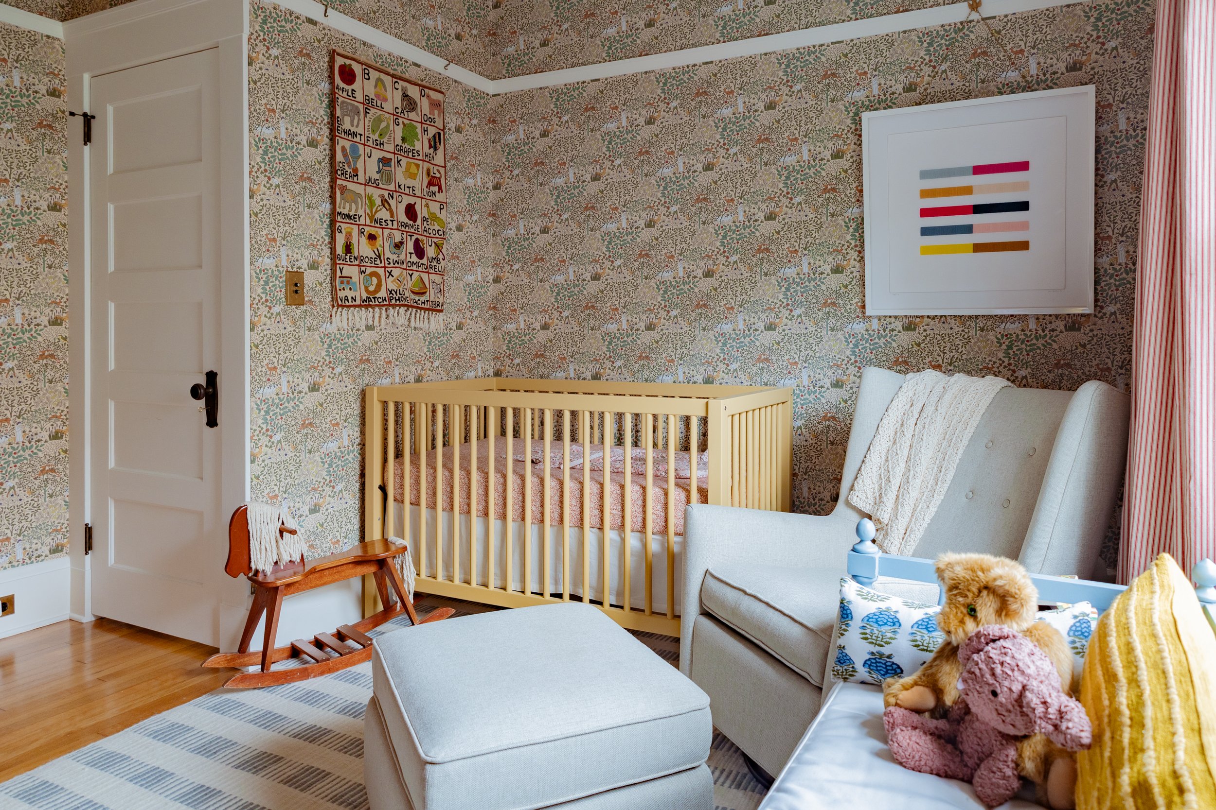
Weekly Roundup

If you've ever looked at professional photos of interior spaces, chances are at least one of the images was captured by photographer, Tessa Neustadt. She just launched an online shop with new and vintage home furnishings. If her shop is anything like her photos and her style, it is sure to be a winner.

The American Museum of the House Cat just opened in North Carolina. Who's in the area and will check it out for me? I've been to the Kattenkabinet in Amsterdam and highly recommend it. The more cat museums the better.

We're going on vacation pretty soon, but I'm already dreaming about my next one. Visiting Great Camp Sagamore in the Adirondacks looks pretty swell.

If It Isn’t Posted to Social Media, Did It Still Happen? Designer, TV host, and all-around cool chick, Sabrina Smelko writes about her take on the weird world of sharing on the internet.

If there's one thing I like more than sweaters, it's murder mysteries. This is both.

Memorial Day weekend brings lots of sales! Here are a few deals for you:

  • Rugs are already 50% off, but you can take another 20% off with code SUMMER20 at eCarpetGallery
  • Framebridge is offering $10 off their custom white frames with code WHITEHOT
  • There are several savings events at AllModern, plus you can get an extra 20% with the code SPLASH
  • 20% off and free shipping at one of my favorite art sources, Society6
  • Use code MW1725 to get 25% off everything at House of Antique Hardware
  • Code BBQ200 will get you $200 off customizable seating at Interior Define
  • Lighting is on sale at Lumens - up to 40% off
  • My favorite place to buy my (men's sized) shoes is ASOS. Use code LIT20 for 20% off
  • Get 15% off everything at Rejuvenation with code MEMORIAL15
  • Everything is 20% off at Rifle Paper Company
  • Non-toxic and eco-friendly mattresses are $150 off at Avocado Mattress
  • No coupon code needed for Wayfair's major markdowns
  • There are too many deals to list for Amazon, but you can get a free trial of Amazon Prime so all of those goodies can ship free
  • Buy more and save more with code SUMMER at West Elm
  • Home Depot and Lowe's both have a rebate for $10 off for each gallon of paint you buy
  • Target has patio and home and furniture items for 30% off. With code HERO you get another 15% off
  • With code MEMDAY you can get 20% off Joss&Main's sale events
  • Fellow San Diegan Janell is offering 20% off her vintage rugs at Mesa Vintage with code REMEMBER
  • Many modern furnishings from Article are on sale this weekend
  • There's a bunch of killer deals at Old Navy's Memorial Day Sale
  • Jeans are 30% off at Levi's with code MEM30
  • Warby Parker's eyeglasses home try on is always free - no coupon needed!
  • Code SUMMER will earn you 20% off at McGee & Co.
  • I swear by this period underwear. No coupon needed to get 30% off at THINX this weekend
  • There are many discounts on Pottery Barn but with code SAVEMORE you can get an even bigger discount
  • One of my favorite art retailers is offering 25% off. Use code SUMMER2017 at Artfully Walls
  • San Diego and Los Angeles folks - get 10% off vintage furniture at Loveseat

Happy weekend!

Weekly Roundup

Are you ready for Mother's Day? If not, I've rounded up a few gifts that are sure to delight the moms in your life!

Remember all of that art that I raved about last week? Well, with this link, you can get 20% off your Society6 order plus free shipping through May 6th! Find a design mom will like, then have it printed as a mug, pillow, framed print, tote bag, or whatever she fancies! Click here to get the promo and browse my favorite pieces. For even more art prints options, I'm sure you can find something she'd enjoy at Minted. If not, get something custom made or commissioned!

Maybe in lieu of a tangible item, she would like her gift to empower women and girls in need. International Rescue Committee has some wonderful gift options including a safe birth kit, a year of school, and small business training. These options range from $21-$192 and make a major impact.

Might mom need some new frames? I highly recommend these $95 glasses (frames and lenses!). Both my prescription eyeglasses and prescription sunglasses are from Warby Parker. I wear these every day but I'm planning on getting these to switch up the look every once in awhile.

Is mom into DIY? Perhaps you can interest her in some woodworking supplies and hardware from Rockler? A pressure washer that I love because my neighbors think I'm playing with a robot? Classes and supplies for making her own goodies at Craftsy? The miter saw we used to install picture rail molding?

For moms with a great sense of humor, illustrator Chipper Things makes adorable flow charts, and this one all about mom makes for a great card.

For the literary mom, In The Company of Women is a must have and will keep her inspired as she continues her passions.

Is she a gardening mom? I have this elevated garden wedge and love how easy it is to harvest without kneeling on the ground, and it just looks pretty.

Is mom tricky to shop for? Gift her Amazon Prime so she can buy what she wants with free (and fast!) shipping. Plus she can stream her favorite movies and TV shows.

I hope these ideas give you procrastinators some inspiration!

One Room Challenge Week 5 - Giving a Chair a Facelift

There's only one week left in the One Room Challenge! Over the past five weeks, this room has completely transformed. I'll share more before and afters next week, but let's get into this week's project.

I bought a chair off Craigslist years ago during my mid-century modern phase. However, I wasn't in love. The upholstery color didn't work in any room of the house, the webbing was totally stretched out, the frame was separating, and the finish was chipped. It was originally from Urban Outfitters, so it's not a vintage heirloom and thus I have no problem messing with it. Note that I do not condone painting 60-year-old furniture just because you're bored of it.

The Gold Hive How to Update a Chair
The Gold Hive How To Update A Chair

The chair sat in the living room for two years and every time I saw it, I thought about how I wanted to get rid of it. With a chair that needed some love, and an excuse to give it new life (thanks One Room Challenge!) I decided that the chair could stay a little longer - with a refresh and in a new room.

The first step was to update the frame. Since there was no gorgeous wood grain to reveal under the existing finish, painting was the only option. Considering I paint things pretty much only black or white (or Salamander!) the choice was easy. Black!

The Gold Hive How to refinish a chair

First, I disassembled the frame and removed the webbing. I later found out that a big reason the webbing sagged and the frame was coming apart was the previous owner had assembled the seat upside down. The puzzle didn't fit together so it was putting pressure in all the wrong spots, and the poor chair couldn't hold up.

The Gold Hive How to refinish a chair

I then gave the frame a light sanding to rough up the surface for paint and to smooth out the chipped spots before dusting each piece with a coat of primer. There's really no reason to skip this part. I'm a big fan of primer and always recommend tossing it on because your paint will adhere so much better - even if you're using a paint and primer in one.

The Gold Hive How to refinish a chair

I used a satin finish paint because flat would look well, flat and a little too, "hey look, I spray painted this chair" while a glossy finish would be like "woah, you spray painted that chair." Catch my drift? Satin has just the right amount of sheen.

The Gold Hive How to refinish a chair

After a few light coats of paint, I worked on re-webbing the seat.

The Gold Hive How To Repair Webbing on Chair

First, I stapled one end of the webbing to the frame. Then, I use this webbing stretcher (torture device) with the rubber end on the frame, and the spikes in the fabric to create tension on the strip by pushing the tool down to stretch the fabric.

The Gold Hive How To Repair Webbing on Chair

Once it's as taught as a drum, I stapled the fabric into the other end of the frame. You may think that pulling on the fabric by hand would be enough, but that torture device, I mean webbing stretcher, does the job so much better. Trust me.

The Gold Hive How To Repair Webbing on Chair

Once a few staples have secured the fabric, I cut the it with enough overhang to fold it back over the staples and staple again. I used this gal, but this pneumatic staple gun would be so dreamy. After all of the webbing strips are complete, I reassembled the chair (not upside down!).

The trickiest part of the whole process was the fabric. I fell for this Painted Check fabric by Robert Allen from Dwell Studios because it was a modern take on plaid and it was in my favorite color palette, black and white. The pattern choice is sure pleasing to look at, but boy was it tough to work with. Had I chosen a solid color or a busy pattern, I could have just cut the pieces and sewn them together. But no, I had to pick a fabric with a bold, high-contrast, large-scale, stripe - and a wiggly stripe to boot. I needed the pattern to give the illusion of wrapping around the sides of the cushion, so matching each piece of fabric to its four adjoining edges was critical. This is probably easy peasy for a professional, but I am not. Here's how I did it.

The Gold Hive How To Rehupolster a Chair

First, I deconstructed the existing cushion and used the pieces as a template to create a new pattern. It's important to note that fabrics can stretch over time, so duplicating the exact pattern may not be the best idea. My fabric was stretched, so I slimmed down my new cuts just a hair.

The Gold Hive How To Reupholster a Chair

I started with the top piece (where you put your tukhes) and matched everything to it. I cut each piece in the order of how visible it is. This way, if things got misaligned towards the end, the issue would only be spotted in the back.

To form each of the side panels, I layered the primary piece atop the roll of fabric and lined it up to its exact same pattern. I did this to create a guide so I could visualize where the cuts would need to be based on the half inch seams I'd sew later.

The Gold Hive How To Reupholster a Chair

Here, the primary piece is on the right, layered on top of the roll. The teal piece is the template of the new side panel that I need to cut. I folded back a half an inch of the cut piece and pinned it back with the purple pin to show how much fabric will be hidden with the seam. The teal piece already has folds from the original seams so I butted them up. This shows me exactly where the side panel needs to be in relation to the pattern in order to match the main piece. I then pinned the teal piece down and traced the outline onto the roll of fabric, then cut it out.

Once I figured out the method that worked best for me, I found an easier solution that uses the same principle.

The Gold Hive How To Reupholster a Chair

Instead of using the teal fabric template and visualize the multiple seams, I nixed the template altogether and just used its measurements. I layered the fabric on top of its matching pattern, then slid a ruler an inch under the fabric, then marked the width that I needed the finished piece to be. It's the same idea, just with fewer steps.

The Gold Hive How To Reupholster a Chair

Once I cut out the pieces, I used colored pins to mark corresponding edges.

The Gold HIve refreshing a chair fabric-0051.jpg

For the back panel with the zipper, I did the same process, but with two pieces and a zipper sandwiched between. For the cushion's bottom piece, I modeled it off of the front panel the way I modeled the front panel off of the top piece. This was to ensure that the lines matched on the cushion edge that was most visible.

The Gold Hive How To Reupholster a Chair

Finally, all of the pieces were sewn together and stuffed with the existing cushion. Then, I did it all over again for the second cushion.

Now that it's completed, I'm super pleased with how well the squares line up on each of the seams, as well as in the transition from the bottom cushion to the back cushion. The back panels of each piece don't match up because it is physically impossible, but I'm a-okay with that. Please feel free to weigh in on more efficient upholstering techniques, I'm sure there are great options out there!

The Gold Hive refreshing a chair
The Gold Hive How To Refinish a Chair

Doesn't she look pretty with this pillow?

If you're here because of the One Room Challenge, I hope you'll subscribe to the blog to get future blog posts in your email! Be sure to follow along on Instagram, too!

One Room Challenge progress:
Week 1 - the before, the inspiration, and the plan
Week 2 - paint, paint, paint
Week 3 - how to install picture rail molding
Week 4 - sourcing the artwork
Week 5 - refreshing a chair
Week 6 - the reveal!


Don't forget to admire the other spaces that are a week away from their grand reveal! Check out both the featured and guest bloggers.

Want remember how to refresh a chair for your next project? Pin this image below. While you're at it, follow me on Pinterest!

How to refresh a chair - The Gold Hive

Weekly Roundup

Happy Friday!

The Gold Hive Hotel Del Coronado

Earlier this week, I played tourist in my hometown and explored the Hotel Del Coronado. The rambling 1888 Victorian beach resort is quite the looker. Since beaches aren't my thing, I enjoyed hanging out in the lobby checkin' out the woodwork.

It isn't even May yet, but Domino is listing the best design blogs of the year. Which are your favorites? Are any missing from the list?

Before we got rid of cable, I used to have HGTV or DIY network playing in the background while I cleaned the house or did projects. The voices kept me company, and I'd find inspiration during periodic glances at the screen. Without the comfort of Rehab Addict marathons, I don't have a show to keep me company that I can tune in and out of as I putter around. Until now. Grand Designs is finally on Netflix and I'm so into it. Each episode covers the build of unique houses from start to finish. This home in the middle of the countryside built from shipping containers and clad in rusty panels is a stunner.

The Handmaid's Tale

Speaking of TV shows, are you watching The Handmaid's Tale? I remember how gripping the novel was when I read it years ago, and the TV show is just as moving. In addition to a marvelously chilling plot, the sets are beautiful. That paint color looks pretty close to Salamander, eh?

Luxury designer brand Balenciaga designed a $2,145 purse that looks nearly identical to the $0.99 IKEA bag that many of us have in our closets. IKEA's reaction is on point.

Does this mean I shouldn't pull out all the weeds?

Have a great weekend!

One Room Challenge Week 4 - Sourcing The Artwork

It's already week four of the One Room Challenge! We're over halfway there and the room has earned dark green paint and picture rail molding. This week, I got to hang the artwork!

This image of a man pulling a girl out of a hole is my favorite piece in the whole room. I'm obsessed with all of the collage pieces by this artist, Richard Vergez. I got this piece and (and all of the others in this post) from Society6, which is such a great resource for framed art by independent artists. The beauty of it is you can get your favorite design printed as a framed print, mug, duvet, tote, or pillow, like this one!

I can't have a room without florals! This print as a pillow does the job.

There's so much beautiful artwork (and bad artwork!) out there so deciding is such a feat. I've rounded up a few more of my favorite artworks from Society6. You can also find more of my curated pieces that I'm crushing on here.

Sources from top left: Rainier Eunice Lake The Dreamer / Colors / D24 Mountain Trees C16 / By the Hills, revisited Crown Into Abyss / El Matador Close Noir / Glacial

While I ultimately bought my prints from Society6, Minted is another great source for art. Here are some swoon-worthy pieces.

The Gold Hive Favorite Art from Minted

Sources from top left: Spiced Cider/ Blue HIlls / Road Trip 2 Torched / Dance Abstract Watercolor A Slight Chance / Conversation II / Broken Clouds Whispered Rain Reflections III / The Forest

I shared last week how much I love picture rail molding and how to install it. Well, here's how to use it! Simple dimple.

The Gold Hive Installing frames on picture rail molding

You can find picture rail hooks in a variety of finishes, shapes, and sizes, so pick whatever works for your home's style and your decor. I got these from House of Antique Hardware for their simplicity and the way the brass matches the aged brass of the switch plates.

Attaching the hook to the frame is as simple as twisting on a wire. The key is to select a wire that can withstand the weight of your frame. The Society6 prints are quite lightweight so I was able to go with a thinner gauge wire, but this same wire previously snapped when I tried using it to hang a mirror. Oops. If you don't want to use wire, rope or chain are great alternatives. I prefer how subtle the thin wire is because it doesn't take attention away from the main attraction, yet you still see a glimmer of it when the light hits just right.

The Gold Hive Installing frames on picture rail molding

I like to start by twisting the wire on to the hook so I can focus on making the twist as clean as possible, since you'll see it. After measuring how high the image will hang, cut the wire to length, leaving several inches to twist into the back of the frame. For a strong hold I like to twist the wire on, then double twist over it again.

The Gold Hive Installing frames on picture rail molding

After a bit of finessing, you have a photo hung on the wall without any holes! While I adore these new prints, and plan on enjoying them in this room for the long haul, I love having the flexibility to move them around the house without having to patch nail holes. 

The Gold Hive Installing frames on picture rail molding

The two large prints over the couch are by Lucie Birant. Deciding on a diptych is tricky because you want them to go together, but not too much. The key is for them to be sisters, not twins. Rather than picking two pieces that are nearly them same, but slightly different, I opted for two very different images, but by the same artist. They aren't matchy matchy, but they go together because they still have the same pencil work and overall style. Emily Henderson has a great PSA on avoiding generic art and how to make diptychs look grand.

The Gold Hive Sourcing Artwork

While all of the new artwork for the room was sourced from Society6, I searched high and low on lots of other websites such as Minted, Artfully Walls, and 20x200. Society6 had the best prices and the quickest turnaround for a room makeover on a tight timeline, but I really had to sort through the artwork, because I didn't love it all (remember, bad art good walls). I like Artfully Walls for the easy search features that help you curate based on themes and colors. 20x200 sells limited edition art prints that are really unique (I'm still waiting for this one and this one to arrive in the mail). Minted has a lot of great pieces that are easy to love. They aren't generic, nor too quirky like the painting of the Denny's Parking Lot I ordered from 20x200. Check 'em all out! Or, if you have your own artwork or an existing piece you want to frame, take a look at Framebridge for custom framing options at great prices.

To recap, the prints I chose for the room are Minimal and Palm by Lucie Birant, Let Me Go Or Squeeze Me Tighter by Richard Vergez, The Path by Carlos ARL, and Mount Cook Lily (Night) by Andrea Stark.

If you're here because of the One Room Challenge, I hope you'll subscribe to the blog to get future blog posts in your email! Be sure to follow along on Instagram, too!

One Room Challenge progress:One Room Challenge progress:
Week 1 - the before, the inspiration, and the plan
Week 2 - paint, paint, paint
Week 3 - how to install picture rail molding
Week 4 - sourcing the artwork
Week 5 - refreshing a chair
Week 6 - the reveal!

Be sure to admire the other rooms that are four weeks into being completely transformed! So many featured and guest bloggers are doing big things!

One Room Challenge Week 2 - It's All About That Paint

The biggest transformation for the One Room Challenge's makeover of the den/guest room is the paint. And we're getting into it first!

I had loads of inspiration and lists of paint colors that had been used successfully in multiple spaces. I was trying to marry the wall color with the blue velvet couch that I planned for that room to give it a dark-on-dark upgrade without making the room look monochromatic. As a reminder, here's the before, inspiration, and design plan.

Clockwise from upper left we have Salamander by Benjamin Moore, Hunter Green by Benjamin Moore, Pine Grove by Clark + Kensington, Tarrytown Green by Benjamin Moore, and Narragansett Green by Benjamin Moore.

I painted swatches on the back of a foam core presentation board, since I already had it on hand (I use it as a reflector for photos) but you could instead buy the paint sample boards at the paint store. I was quick to rule out a few colors, then painted my favorites on the wall. By the end, Salamander won our vote.

While rolling on the paint in broad strokes provides immediate satisfaction, my painting specialty is cutting in the edges. I don't use blue tape to get crisp edges, rather a steady hand and some trusty tools.

I use the HANDy Paint Cup whenever painting edges, when I need to be more mobile than a gallon of paint allows, or when I'm working with small amounts of paint. This convenient tool fits in your hand, has a magnet to hold the brush, and cleans up so easily (just let the paint dry in the cup, then peel it off - so satisfying!).

The Wooster Shortcut paint brush is perfect for cutting in. I'll use almost any 2" angled brush for the job, but this lil' one is so comfy with its rubber handle.

When scooching around on the floor to paint the edges on the baseboard, a kneeling pad is a must. I use it for gardening, painting, tiling, etc. While I don't think you'll find this crouched painting position recommended on HGTV, it works for me.

In addition to the walls needing a couple of coats of paint, the baseboards hadn't been touched since before the floors were refinished. They were scuffed up from the sander and I just left them like that for two years. A nice coat of Benjamin Moore's Simply White was all they needed to look their best. The baseboard, three doors, and a window all needed some paint love. Lucky for me, I had the S-Town podcast to keep me company during the hours and hours of painting.

After a weekend's worth of cutting in, I'm swooning over the freshly painted room. The green is so pretty and has a velvety look when the light hits it mid-day. At night, it's nearly black - which is just what I was going for.

Next week, I'm tackling the picture rail moulding installation! Come back over the next few weeks as this room gets a total overhaul. Don't forget to admire the work of the featured and guest bloggers participating in the One Room Challenge!

If you're here because of the One Room Challenge, I hope you'll subscribe to the blog to get future blog posts in your email! Be sure to follow along on Instagram, too!

One Room Challenge progress:
Week 1 - the before, the inspiration, and the plan
Week 2 - paint, paint, paint
Week 3 - how to install picture rail molding
Week 4 - sourcing the artwork
Week 5 - refreshing a chair
Week 6 - the reveal!

One Room Challenge Week 1 - A Moody Makeover

I'm currently digging moody colors. Deep blues, forest greens, and dark grays are all I'm pinning as of late. I mentioned a few weeks ago that I was contemplating painting my kitchen cabinets (again!) to give them a deeper hue. Since it's not the best use of my time, I've directed my color affection to another space. Luckily, the One Room Challenge is starting at the perfect time to scratch the moody color itch! Scroll through to see the room I'll be transforming over the next six weeks.

If you found me through ORC, welcome! I'm Ashley and for the past two years I've been restoring a craftsman bungalow in San Diego, CA. Learn a touch more about me here, and preview the before-and-after room transformations here.

Without further ado, here is the inspiration.

See where I'm going? What I particularly love about these spaces is how they play with dark on dark tones. Studio McGee's emerald couch against the navy walls and Julia's black sofa on the deep green are what moody dreams are made of.

So which space will earn its dark makeover? The family room/den/media room. What is a good name to call a space that we pretty much use only to fold laundry and watch TV in? The internet tells me that an alternate to the word "den" is "snug." I kinda like it. Please weigh in.

This room has received little to no love over the past two years. 100% of the furniture pieces were brought from our rental, so I've grown tired of them. The paint color is a reject color that I bought for our master but didn't like once painted on all of the walls. (lesson learned: paint BIG swatches before you buy a gallon of paint). Also, the trim never got its final coat of paint. 

The Gold Hive One Room Challenge Week 1

The room is fine, but it could become the dark hued space of my dreams. I'm looking forward to spending the next six weeks transforming it. I hope you'll stay tuned and check out the featured and guest bloggers participating in the spring 2017 season of the One Room Challenge!

One Room Challenge Mood Board - The Gold Hive

Sources: couch / rug (one of a kind) / lamp / pillow / chair (existing) / chair fabric / credenza (vintage) / painting

If you're here because of the One Room Challenge, I hope you'll subscribe to the blog to get future blog posts in your email! Be sure to follow along on Instagram, too!

One Room Challenge progress:
Week 1 - the before, the inspiration, and the plan
Week 2 - paint, paint, paint
Week 3 - how to install picture rail molding
Week 4 - sourcing the artwork
Week 5 - refreshing a chair
Week 6 - the reveal!

Bathroom Plans

Last week I shared some of the inspiration for our bathroom. The collection of images made a few must-have elements pretty clear: subway tile with dark grout, moody walls, hex tiles, marble, and period-appropriate finishes.

The Gold Hive Bathroom Mood Board

SOURCES: paint / medicine cabinet (ours is original) / faucet / hex tile / sconce (ours is vintage) / cabinet latch / pendant (ours is vintage) / register (ours is vintage) / subway tile / grout / console sink

We had a pretty good idea of the plans for the bathroom, but small tweaks were made over the course of the renovation. The below designs were drafted early on, so don't take these measurements as an exact blueprint of the finished product. Rather, a starting point for where we were headed.

The Gold Hive Bathroom Plan View

The layout of the existing bathroom had no reason to be changed. I like having the toilet tucked in the corner, the sink has ample room around it, and the tub configuration allows for storage at the foot of it. Many bathrooms like this are only 60" wide which gives the tub just enough room to fit wall to wall. Since we had another foot of space, we could have gotten a longer tub to stretch the length of the room, but we opted to make two spots for storage, seen in the upper right corner of the above image. The little square that measures 6.5" deep is accessible from the shower. A perfect place to nestle bottles of shampoo without having them on display.

The Gold Hive Bathroom South View

The 13" space on the right is a cabinet for toiletries, refill bath products, cleaning supplies, and more. I think it's my favorite feature in the whole bathroom.

The window shown here is a sizable improvement from the existing one, but we ended up going even bigger!

The Gold Hive Bathroom East View

Because the sink is floating in between the toilet and the tub, I didn't want a traditional vanity. I think vanities are really pretty when they look like built-in cabinetry as an extension of a wall. But on their own, vanities can look like boxes floating in the middle of a room. Thus, we opted for a console sink that visually opens the space. Sure, we gave up storage, but I'm a-okay with that. Neither Ross nor I own a lot of products for primping, so the storage at the end of the tub is perfectly adequate for us.

Other than a few tweaks, those are the plans for the bathroom! If you want to jump two years into the future, you can see the finished bathroom here and here and here.

For more bathroom progress, click the link below then subscribe so you don’t miss out when I add a bathroom in 2019!

Hashtag Bathroom Inspo

You asked for it, so the bathroom remodel is next to share!

Since we were putting a new bathroom in an old house, I wanted the design to pay homage to the old house charm. I'll never know what the original bathroom looked like before we got our hands on it, so the design options were vast. Should I do classic black and white or colored tiles? Bold or understated? Authentic period pieces or reproductions? Simple or a bit more eclectic? Entirely vintage or a mix of old and new? Minimal or snazzy?

Here are a few of the spaces I took inspiration from when designing our bathroom.

I love how soft yet high-contrast this feels. A clawfoot tub is also oh-so-dreamy. We ultimately weren't able to incorporate a clawfoot soaker in our bath remodel, but maybe there will be room in the next bathroom that we hope to add on.

Don't even get me started on my love for floral wallpaper. This Ellie Cashman paper is gorgeous. The pedestal sink is such a perfect way to show off wall details.

Source: Clay Squared

Source: Clay Squared

This sink with the look of turned legs is so quaint in the best way possible. The tile is understated but filled with detail. There's hex, a variation on greek key, a pencil liner, decorative cap, and subtle cove base tile. The chair-rail height tile surrounding the whole room was a must-have on my list.

A painting in lieu of a mirror is fine by me. The tile work here is far simpler than the detailed profiles above, but it exudes character. I adore how the aged sink legs and worn tub coexist with the new hardware.

That window is perfectly gigantic. If privacy were no issue, I would have installed a window the full size of the wall.

That retro green tile is to die for, but it's all about that recessed soap dish.

Source: Unknown

Source: Unknown

The moody wall color was definitely a feature worth stealing. I think I need to add more artwork, though, because this is the bee's knees.

Why do moody walls when you can do a moody ceiling? I love how this bathroom has a bold and modern feature without sacrificing the traditional tile. 

Storage is key in small bathrooms, so why not borrow space between the studs for recessed cubbies? Our final bathroom design allowed for this, but in a slightly different variation.

I borrowed an element from each of these bathrooms, and the many others on my Pinterest board to create the bathroom that's perfect for us. Stay tuned!

Weekly Roundup

Domino compiled a collection of some gorgeous wallpapers for spring and I think this floral one from Sandberg Wallpaper's BrunnsnΓ€s Collection is my favorite. 

On Wednesday, I shared the story of our floor refinishing. We hired the job out, but it's totally DIY-able. Cathy and Garrett of The Grit and Polish did it by themselves and boy, do those floors shine!

Last week, I asked you to weigh in on whether or not I should re-paint the kitchen cabinets a deep green. The votes are split, so I don't know what my plan is, yet. With color on my mind, I was taken aback by this house in a nearby neighborhood that hit the MLS this week. Wowza!

Colorful-house-in-golden-hill

Michaels is having a killer sale on frames right now, including online. Alternatively, if you need custom framing, here's $10 off your first order at Framebridge.

I've watched every.single.one of Casey Neistat's videos, so I've developed a crush on his wife and her entrepreneurial, no-nonsense, sarcastic spirit. Resource Magazine featured her so I can't wait to get my hands on a copy. I searched all around town for the latest edition but couldn't find one, so I read the preview online. Candice and Casey are each highly driven makers - truly inspiring for this couch potato.

I'm not a big clothing shopper, but I did get some new shoes this week. I've been wearing Birkenstock clogs for ages so these are a major upgrade in the style department. And yes, those are technically men's shoes, but so what - plus, my feet are too big for lady shoes. 

We went to the movies for the first time in probably two years (I've mentioned I'm a homebody, right?) to see Get Out. It was exceptional. I can't stop thinking about it, and I can't stop listening to this Childish Gambino song that was featured in the film. Speaking of songs in movies, I'm also digging this song by Michael Kiwanuka which plays during the opening of the show Big Little Lies.

Spring has sprung so the front yard is gaining new blooms. San Diego is still getting much-needed rain which is making the fresh plantings very happy. The Arabian lilac is one of my favorite new plantings with its half-purple and half-green leaves.

Happy Friday!